Translate

Showing posts with label Pages. Show all posts

Friday, 24 October 2014

Anti Bullying Zine

For my second project of level 5 I chose to do a project on cyber bullying, I have very strong links with this subject matter and have always wanted to do something to raise awareness.

I decided to do an 8 page folded zine, these are easy and cheap to make and distribute if needed.

I have so far done 2 pages of the zine.


The front page, I wanted to use different typefaces to create a cut up dada style. I also wanted to make it quite high contrast so it would stand out and people would be drawn to it but I also wanted to stick with gray scale for the cover just to keep with the typical zine look.

With the first page I wanted to get straight into how to deal with being cyber bullied. I narrowed it down to three simple steps Ignore, Record and Report for bullying offline I would give different advice. I found I was bullied less when I stood up for myself instead of staying quiet. But online standing up for yourself only adds fuel to the fire.

When I'm done I would like to make my zine free and available for people to print out and distribute as long as they keep the end page (which will tell people it was written by me and where contact me).

I want the zine to include why people bully and positive traits which are common among people who are bullied. But I also want people to reach out to the bullies, because bullies bully for a reason and more time needs to be spent on listening so less will be spent on bullying.


This is one of the video's I watched when I was first thinking of making a zine.

I would like to do more zines like this focusing on bullying and mental health.

Wednesday, 13 August 2014

AVDWT Progress August 13th

Needle felted wasp head 


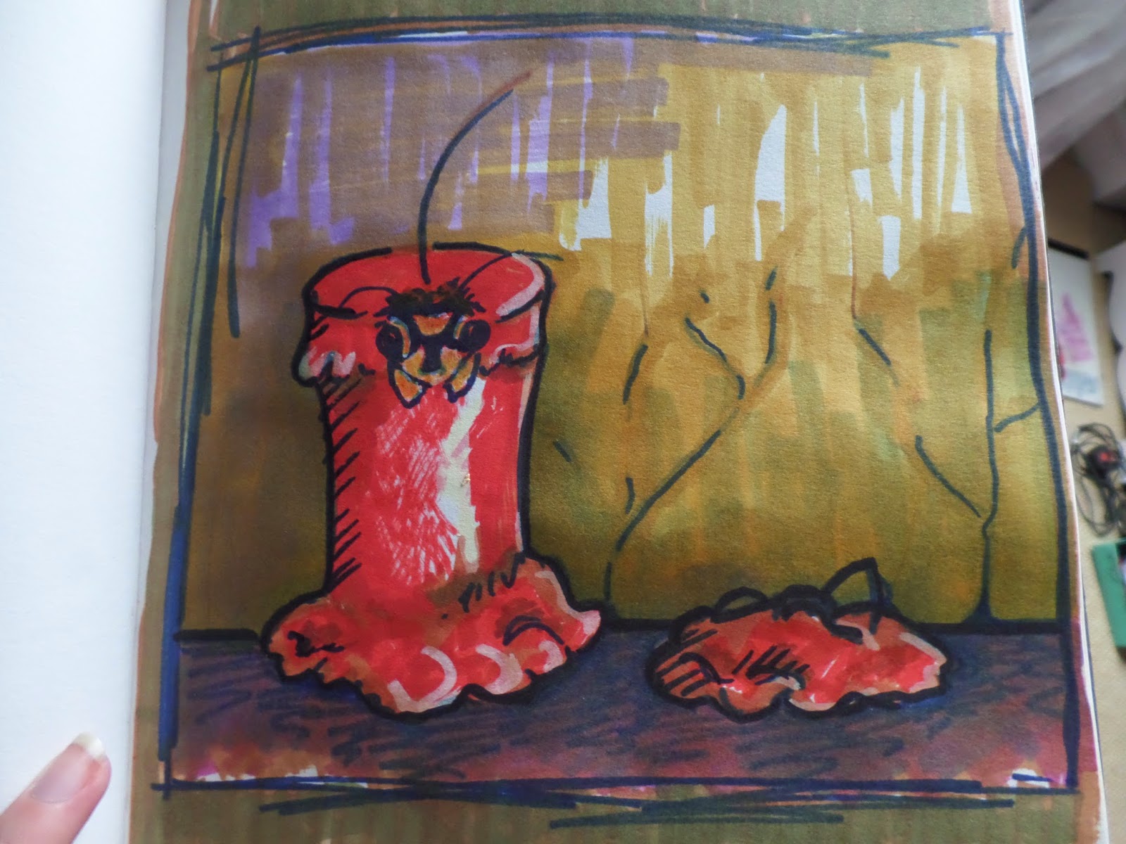
In my more recent drawings based around the book "Wasp Factory" by Iain Banks
I have focused more on the reoccurring theme of the wasp and I have established a style I like to draw them in, which is closer to my regular artwork.


These drawings were based of a segment on page 47 "I'd found the candle-making kit in the cupboard under the stairs five or six years ago, and experimented with the colours and consistences for months before hitting on the idea of using wax as a wasp prison."  There is also a part in the book where Frank mentions ripping the wings off dead wasps. So I combined some of these ideas in my drawings. In the drawings you see above I simplify the wasps making them look more cartoon I think this help convey how the wasps are the innocent party and that they are being used as some sick form of entertainment for Frank. The red candle/red wax is also a motif I have played around with again from page 47 it says "I looked up then  and saw the head of a wasp poking up from the top of a candle on the altar. The newly lit candle, blood red and as thick as my wrist". "The flame, a centimeter behind the wasp's wax-gummed head, freed the antennae from the grease and they came upright for a while before they frazzled. The head started to smoke as the wax dribbled off it, then the fumes caught light, and the wasp body, a second flame within the crater, flickered and crackled as the fire incinerated the insect from it's head down."  I want to look more into these segments because I feel it has so far produced some of the most interesting and enjoyable work of this project.

-----------------------------------------------------------------------------------------------
Page based on page 33 were Frank goes out killing rabbits and one particularly nasty rabbit breaks his "Black Destroyer" which is the name Franks gave to his slingshot. As revenge he blows up the rabbit grounds killing most of the rabbits.  


Monday, 7 July 2014

AVDWT Progress and Inspiration 7th of May


This page's quote was about a death in the family and how people let you get away with crazy things while you are mourning the loss. I used needle felting wool and glue to give the page some texture, I may add more to this page at a later date but I really liked how it turned out.
The next page is about Franks disdain for women and the sea. First I tea stained the page and saw the shape of a woman's face emerge  remembering the quote about his hatred  for women I when with it and painted it in, me adding the blue wasn't intentionally meant to represent the sea but now it's complete it ties the quote in nicely.


This page is about Frank drifting off to sleep and the kind of things his mind imagines as he does so, I might add some layers to this page to make it seem or chaotic. 


--------------------------------------------------------------------------------------
Commissions I have been working on

Custom Music/Vinyl Themed Notebook

Inspiration and interesting links

Fisheye Placebo Webcomic
The Love Parcel
www.bobsmade.com
Axent Wear

Tuesday, 17 June 2014

AVDWT Progress and Jellie Bee 17th of June

I haven't managed to read much more of "The Wasp Factory" just yet but I'll be sure to sit down and read some more at some point today. But yesterday I made a leather cover for my sketchbook, the inside still needs some work but I'm still pretty pleased with how it's turned out thus far.


I went into town and bought two bags of leather scraps for £1.99 per bag and bought some fabric that has the feel and texture of blackout blinds and used that as a base for the cover. Once I constructed the cover on top I cut away most of the base fabric. The only issues I had is I ran out of hot glue and that the book cover ended up being a bit small to remedy this I added some more leather to the edges. For decoration I added some stud stickers I also bought while I was in town. I didn't want this cover to look neat at all so I added some standard brown twine to tie the cover as a closure. The cover still need a bit more work and I shall no doubt be adding more to it over time. 

I also went back to the page on Leviticus an drew what I think he should look like next to the extract I talked about in my last post.


In none project related news I made a video about some stickers and prints I ordered from an artist called Jellie Bee.


Artists I have been looking at:

Tara McPherson
'Supernova' - Invite image for Tara's upcoming show at Merry Karnowsky

Unlike most of the work I look at Tara's work has more of a block colour feel to it. I love this piece in particular because of how it draws the eye in, the black of the background really pushes the character out from everything else. I really like that the stars and hearts in bubbles are passing through the heart shaped hole in the girls chest.  I could sit here all day and analyse this image that the bubbles around the small hearts could symbolize how the artist is protecting herself from getting attached  due to previous heart break hence the heart shaped hole.


Adolie Day is a Frence based ex textile designer of 3 years working in children's fashion, who has now taken up illustration. Most of her illustrations are inspired by fairy tales, she also likes to draw retro styled characters. She works in a range of mediums most prominently (for me at least) watercolour. Her style ranges from detailed to beautifully simplistic.


Pages and articles I have been looking at
In pictures: Art on the Street 2014
www.etsy.com/uk/shop/adolieday
www.facebook.com/pages/Adolie-Day
/www.facebook.com/taramcpherson

Sunday, 15 June 2014

AVDWT Progression 15th of June

WARNING: If you believe in the Leviticus part of the old testament you may not want to read this post or be on my blog at all for that matter.

I'm currently on page 36 of Iain Bank's "The Wasp Factory."

 This first page you may have seen before in my last blog post, I have gone back to this page and started to work into the bottom portion with typographic transfers. I just couldn't stand the empty spaces and there is still to much empty space for my liking. So I'll be refining this page over the next few days.
 I used numbers, letters and symbols it represent this characters need for information. In the book he is and educated man, a man of science whom I would think craves knowledge and information. Since reading further into the book there this character has be described more so I plan on making a tracing paper overlay and re-designing his character over the top of the old one.


The next page is still in progress as well this page is currently full of extracts from the book I found funny or interesting. The extract I focus on is about a person named Leviticus, now this extract is obviously the writer having a bit of a not so sneaky dig at Leviticus which is part of the old testament, most well known for being against same sex relationships/marriage/sex.

The full extract reads "Leviticus Cauldhame, my father's eldest brother, emigrated to South Africa and bought a farm there in 1954. Leviticus, a person of such weapon-grade stupidity his mental faculties would probably have improved with the onset of senile dementia, left Scotland because the Conservatives had failed to reverse the Socialist reforms of the previous Labour government." The quote continues and shows us how much of an intolerant, closed minded dolt Leviticus really is.

In my sketch book I drew inspiration from Dada cut ups to make my own dig at Leviticus. A bit of background about me I am not a religious person and I believe very strongly in LGBT rights being bisexual myself, even if I wasn't bisexual I'm sure I would still be an avid supporter of LGBT rights. One thing I dislike about people who claim to believe in Leviticus is that they pick and chose what they do and do not take from it. I have seen many anti gay marriage protesters wear mixed materials yet that is banned according to Leviticus, and I'm sure they wouldn't blink an eye while eating mussels  when shellfish is also frowned upon according to Leviticus and is mention more frequently to be an abomination than being homosexual. Leviticus in my honest opinion is pure stupidity.

Friday, 13 June 2014

AVDWT Progression 13th of June

Since yesterday I have done 3 more pages for my "A Visual Dialogue With Text" project. Some of these pages I may end up going back to and adding little bits an pieces.

This page is based of pages 13-14 where Frank the books main protagonist is explaining he was never registered as being born, and that there is no paperwork to prove his existence. Not being registered is illegal and his father uses his links to universities to get the proper inoculations for his son. So far in the book it is unclear why his father didn't register him and it's something that I'm starting to question myself.

The bottom half of the page is a phone conversation with Franks brother Eric who is an escaped psychiatric patient who used to feed children maggots and set the neighbourhood dogs on fire.

When Frank mentions the incidents Eric starts to have fits of rage and bangs the telephone receiver against the telephone box he is calling from. Frank seems somewhat worried if not a little bemused by his brothers outrage.

This next page covers page 23 on this page we really start to see just how twisted Frank's logic is. Frank has killed three people and his brother Eric's mother was killed in childbirth because Eric's head was too big and coursed her to hemorrhage which Frank argues that his brother unintentionally murdered his own mother. This could be an attempt to make him feel like less of a villain. On page 13 his father says "Sometimes I think you're the one who should be in hospital, not Eric." Frank maybe using Eric's mothers death as a way of proving he is less insane than his brother.

I actually decided to miss a chunk of text out of this page so I could make my point, I highlighted the words I saw as negative in red on a piece of clear plastic and layered it on top of the page.


The next page is a drawing I did of Frank and Eric's father based up on the description of him in the book, I wrote the description   next to the original drawing I did of him. Funnily enough the first image which came into my mind was nothing like this one, I originally imagined him to wear women's clothing I think his idea was based on part of the description where the writer describes he face as being womanly.

This page still feels a little sparse to me so I think I'm going to pick up some white stickers and put little measurements on them to fill the bottom right hand corner of the page.

Since this post was a little rushed (I have other plans today) I will probably post influences and some other things later.


Thursday, 12 June 2014

"A Visual Dialogue With Text" Progress 12th of June

So far am I'm around 18 page's into my selected text which is "The Wasp Factory" by Iain Banks.

Themes so far

  • Shamanism/Occultism
  • Obsession
  • Madness


Here is what my first page looks like (the first page covers from the start of the story on page 7 to where I'm at currently on page 18)
The main protagonist of the book maintains something he likes to call "The Sacrifice Poles" where he puts the heads of dead animals as some kind of warning to the outside world to keep at bay. One of the heads hanging of one of the poles is that of a mouse, so I drew a mouse skull into my sketchbook (I used a stock image as reference) then drew a mouse head on tracing paper and layered it over the top.

I like adding layers to my sketchbooks because it engages people when they come to look through it.

I also decided even though the book is dark in tone I like to use splashes of colour in my work to really give the pages a bit more interest. I have no doubt at some point I will probably do some black and white compositions in my sketchbook but I do really enjoy working with colour. My pages are very chaotic that's just how I like to work, but I feel this way of working really complements the style of the writing. I recently went back to my Foundation Diploma and A-level sketchbooks to see what I have improved on or what I could take away from my old sketchbooks. In my
old sketchbooks I could see I really got into my work at the time and put my own spin on it, in my first year degree sketchbooks my artwork seemed more restrained and less chaotic and some how that made it lack character in some way. I could see when the work didn't excite me and I feel like anyone who looked at those sketchbooks would be able to see it too.

Back in my Foundation (and A-level) I made my books very interactive and I could see that had disappeared in my university work. The interactivity of my books is one of the things my peers seemed to love about my work, and it's absence was a huge step back. I work by playing with ideas and I like people to also be able to see my thought process translated into interactive things you could do in my sketchbooks. Through play people could go through the similar though processes to me as I was making the work.

The measurement book is an example of me putting that interactivity back into my work. The measurement book was a punishment for the main protagonist, his Dad has an obsession with knowing the exact imperial  measurements for everything, the main protagonist went around the house ripping all the tiny white stickers his Dad would stick on objects with it's measurements on. So as a punishment and character building exercise his Dad makes him go around the house and learn all of the imperial measurements and note them in the measurement book. I feel the ripping off of the white stickers was our main protagonist gaining control over his father and his father tries to gain back this control by giving the main character this punishment. The book is described as being a "huge loose-leaf thing", maybe this punishment was meant to weigh on our main character but his father ended up giving up on the book and resorted to firing the odd question at him. This suggests he gave up on regaining control over his son.  

Some art/artist which inspires me in relation to this project

Artist: Philth 

I really like the colours he has used
in this mural and it he has painted a wasp inside a white circle which looks to have static coming from it, this could maybe be a suggesting the power of nature.

Found on 
Art on the Street


Artist: Benjamin Lacombe

This piece has a rather macabre feel to it rather like the tone of the writing, even though I would say this piece has a rather more elegant feel in contrast to the book which feels to me like it is set in a rather dilapidated and run down island.

Found on
Benjamin Lacombe official 

More of his work can be found here
www.benjaminlacombe.com