Translate

Showing posts with label Blog. Show all posts

Thursday, 29 October 2015

My response to women's sanitary products being classed as "Luxury Items"

I was angered to find out women's sanitary products are classed as a luxury and that some men were comparing their preference for being clean shaven to women's sanitary products. It's not specifically the tax which angers me more the principle behind them being labeled as "Luxury Items". 
Women in 3rd world countries are not as educated because they have little to no access to sanitary products and have to stay off school for 5 days to a week each month. That 5 days to a week puts them behind in their studies making it harder for them to further their education.
So a school year is roughly 195 days, roughly 6 months of the year. Take 5 days average from each month so that's 23. So times that by 6 (months) and that's 138 days. So that's 57 days of missed schooling a year that's roughly 2 months each year.
It gets worse the average start of a girls period is 12 and lets say that girl finishes school at 16. so that's 5 years, so total days a child should be in school is 975 and if you total in the time that these girls have to take off that is a total of 690 days they spend in school total from the ages of 12-16 years of age.
Shocking isn't it?
And people are telling us being in a position to be in education for 195 days a year is supposedly a luxury? We aren't after this stuff for free, we want people to admit this is not a god damn luxury!
Stella Creasy hit the nail on the head when she said "Tampons and sanitary towels, even I'm struggling with the words tonight it seems, have always been considered a luxury. That isn't by accident, that's by design of an unequal society, in which the concerns of women are not treated as equally as the concerns of men,".
Jaffa cakes are zero-rated for crying out loud! Yes stuffing our face with Jaffa's every month is fantastic BUT it is far from essential.   
I would love to at some point create some work around this issue but it would be a stretch to incorporate it into my current project, even though I am sure access to sanitary products is an issue for homeless women. 

Monday, 5 October 2015

Uni project and upcoming stall

My university project 'Outside The Penthouse' is about dispelling preconceptions of the homeless.
Going straight into doing work about homeless people didn't work out very well, I found myself really hitting brick walls, thinking that my super vivid style just wouldn't fit the message I was trying to convey.

I had the idea of depicting the homeless people as monsters because a lot of people seem to adopt the attitude that they shouldn't exist and to validate this I feel people connect negative connotations to homeless people. The most common being drunks, druggies, lazy and uneducated.
I wanted to pull the carpet out from peoples feet and show them how they have been thinking about homeless people compared to how they should be viewing them.

A big challenge with this project it to keep it out of the realm of being too condescending but also try and make it so it isn't a guilt trip. Talking to members of my class they told me that most charity ads are patronizing or tell the viewer though the use of black and white that this should make them feel sad. People don't like being told what they should feel on a subject, that's the reason why differing opinions can spark arguments. I have thought at length how I can stay clear of all of these things and realized it's probably not possible to do, my priority instead has to be keeping these factors to a minimum.

People told me they would rather see something that is uplifting and that will inspire people to help rather than something gloomy which would just depress the intended audience.

My tutor recommended I step away from the theme of homelessness for a bit and focus on creating characters (which is what I enjoy doing) and that has really unblocked me creatively. Since switching the focus I have been coming up with concepts I really enjoy. The project before had become a chore but now it has become something I do for enjoyment and if I have learned anything forcing creativity rarely gives good results. Also my tutor's lecture on metaphor really helped me come up with new ways of communicating my chosen message without blocking myself off creatively.


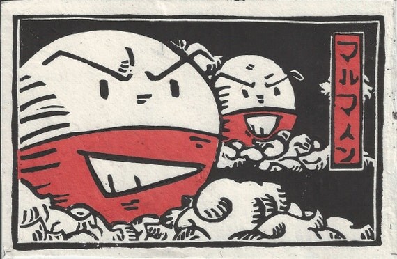
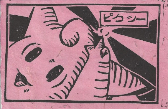
Switching topic, I have a stall coming up in November and I am focusing on making things that are reproducible in order to keep the balance between my stall and uni work. So far I have come up with the idea of doing lino prints, I had a little look on etsy to see if anyone does pop culture inspired lino prints and found one person by the name of Chase or TheBeardedGoldfish as the shop name is called.
If there is one thing in this world I love, it is Pokemon. And Chase does very unique Pokemon lino prints (if only he shipped to the UK). I have always loved the bold look of lino prints. 

He prints them on to rice paper of different colours depending on the character in the print.
I think the boldness of a lino print would look absolutely amazing paired with a vivid watercolour background that I have recently been creating with Dr Ph Martins concentrated watercolours.

This is also something I would love to experiment with for 'Outside The Penthouse'. Maybe I could even bind them into a zine format.


Thursday, 30 April 2015

PDP Interview #3 with Jenni Illustrations

Interview with Jenni Illustrations


Jenni is an artist from Australia, I aspire to be as successful as she is. She sell's her work on clothes, posters, playing cards, stickers and the list goes on. I chose to interview her because she is very much inspired by the same things I am and despite the common interests our styles are very different.

Q1. I can see a definite anime/manga influence in your artwork is there anything else that inspires how you work? I think seeing other artist with the same style influence me. Anything cute and colourful/bright. Living and having kawaii things also influence me and my work.


Q2. What advice would you give someone who wants to sell their work at conventions/events? Having motivation and passion for your work is something you need. Loving your work and making other people love your work is another. Also knowing what people really like is something to think about. eg, whats your target audience? what will they be attracted to


Q3. If you could experiment with any medium you want what medium would you choose? I like pen work and watercolour. I always draw digitally but there's times I just want to get away from the computer and free myself with some traditional mediums. 


Q4. Do you prefer having lots of little projects on the go or one big project? I like either really. sometimes mostly my little projects is really related to my big project. eg: my original character in diff drawings(small project) while big projects is like having them on clothes, products, animation.


Q5. Do you ever have problems with motivation, if so how do you keep yourself motivated? I do a lot of the time. (I'm sure no one can tell) haha. I get a lot of inspiration from looking at things. everyday life around me, music I listen to ( every day, all day till night I listen to music) keeps me sane lol Having you guys ( my followers and friends) who enjoys my drawings keeps me motivated. who cares about my work. who wants to share my work/talk about me all over the world is one thing I really appreciate keeps me going =]


Find more of her work here

Monday, 27 April 2015

Difficulty getting interviews

I have lost count of the amount of artists I have tried to contact just to name a few who have not replied Erik Jones, Glenn Arthur and Camilla D'errico who said she would answer my questions and never got back then I contacted an artist I have bought artwork form before called Destiny Blue  and this is what I got back.


Any responses other than answering my questions was pointing me towards a previously done Q&A or an FAQ.

Also a lot of artists I wanted to contact didn't have a contact email that I could find and on there facebook pages had taken off the option to inbox them. I am starting to feel very apprehensive about if I will get my final interview and if they interviews I have done will be seen as being suitable. I have tried my best in interview people who's work inspires me but they seem quite hard to get a hold of. 

Sunday, 15 March 2015

PDP Interview #1 with Jellie Bee

I first discovered Jellie Bee via her YouTube channel after buying some of her artwork I had the pleasure of meeting her at Japan Day 2014 in Manchester. Since Jellie Bee is influenced by very similar things to me I thought she would be interesting to interview.


1. You're work looks anime/cartoon influenced; did standing out from the crowd ever cross your mind when you were developing your style?

Actually, when developing my work, I actually wanted to have my work look more like everyone elses, particularly successful artists. However, people started to compliment me on the fact my work was really recognisable to them and that's when I realised being myself was easier and better all along.

One of Jellie Bee's digital paintings, she often does these on a single layer.


2.When did you start selling your artwork and how long did it take you to build a steady amount of people who buy your work?

I started selling my artwork on stickers from around early 2010 and it picked up quite quickly. I started my own online store in 2011 but it took until 2013 for it to become a lot more steady. Convention selling has kept the interest in my online store going strong.

 3.What is the most interesting medium and/or canvas you have ever worked on?

My absolute favourite canvas is the sketchbooks that I customise. There's a real sense of achievement when I've finished one, because it's original art, but also a useable product. I find it interesting every time, as they always come out more special than I expected.

One of Jellie Bee's custom sketchbooks she sells on storenvy, she sells some pre-made and is often commissioned to do custom designs. 


4. What are your favourite artists? Have they influenced your style?

Massively so. My favourite artists are Lois van Baale (Loish); Marc Brunet (bluefley/Cube Brush); Mary Blair and Victoria Ying.
Each one has inspired me in different ways: Loish represents the skill levels I've always wanted to reach; Marc Brunet's techniques have always pushed me, his tutorials improve me in a way no-one else's ever have. Both of these artists pushed me to try single-layer painting, colour experimentation and portraiture and even though my painting skills are lightyears away, they've helped form who I am today with my digital art.
Mary Blair and Victoria Ying represent the illustrative side to my work, the side I find more relaxing and easier, but also the side I tend to criticise more.


 5. Do you feel your style is still developing?
Oh, always. I had a funny conversation with someone in a livestream recently, who said they felt comfortable with their digital style after only two weeks of experimentation. I said that it's taken me 9 years to become comfortable with my approach and to have more pride in my work. I started in Dec 2005 and it wasn't until Dec 2014 that I really felt connected. It will always develop, because I'm always torn between sticking to one style - painting, or illustrative?
Not only that, but I also like to practice with sumi-e and ukiyo-e style art a lot, so there's a third style I like to do. It's so confusing sometimes, but I'm happy right now with the progress I'm making. I'm just excited to see how I improve over the course of my life!


Want to check out Jellie Bee for yourself?
Here are some of the places you can find her.

Art Facebook Page

Business Facebook Page

Storenvy

Sunday, 15 June 2014

AVDWT Progression 15th of June

WARNING: If you believe in the Leviticus part of the old testament you may not want to read this post or be on my blog at all for that matter.

I'm currently on page 36 of Iain Bank's "The Wasp Factory."

 This first page you may have seen before in my last blog post, I have gone back to this page and started to work into the bottom portion with typographic transfers. I just couldn't stand the empty spaces and there is still to much empty space for my liking. So I'll be refining this page over the next few days.
 I used numbers, letters and symbols it represent this characters need for information. In the book he is and educated man, a man of science whom I would think craves knowledge and information. Since reading further into the book there this character has be described more so I plan on making a tracing paper overlay and re-designing his character over the top of the old one.


The next page is still in progress as well this page is currently full of extracts from the book I found funny or interesting. The extract I focus on is about a person named Leviticus, now this extract is obviously the writer having a bit of a not so sneaky dig at Leviticus which is part of the old testament, most well known for being against same sex relationships/marriage/sex.

The full extract reads "Leviticus Cauldhame, my father's eldest brother, emigrated to South Africa and bought a farm there in 1954. Leviticus, a person of such weapon-grade stupidity his mental faculties would probably have improved with the onset of senile dementia, left Scotland because the Conservatives had failed to reverse the Socialist reforms of the previous Labour government." The quote continues and shows us how much of an intolerant, closed minded dolt Leviticus really is.

In my sketch book I drew inspiration from Dada cut ups to make my own dig at Leviticus. A bit of background about me I am not a religious person and I believe very strongly in LGBT rights being bisexual myself, even if I wasn't bisexual I'm sure I would still be an avid supporter of LGBT rights. One thing I dislike about people who claim to believe in Leviticus is that they pick and chose what they do and do not take from it. I have seen many anti gay marriage protesters wear mixed materials yet that is banned according to Leviticus, and I'm sure they wouldn't blink an eye while eating mussels  when shellfish is also frowned upon according to Leviticus and is mention more frequently to be an abomination than being homosexual. Leviticus in my honest opinion is pure stupidity.

Friday, 13 June 2014

AVDWT Progression 13th of June

Since yesterday I have done 3 more pages for my "A Visual Dialogue With Text" project. Some of these pages I may end up going back to and adding little bits an pieces.

This page is based of pages 13-14 where Frank the books main protagonist is explaining he was never registered as being born, and that there is no paperwork to prove his existence. Not being registered is illegal and his father uses his links to universities to get the proper inoculations for his son. So far in the book it is unclear why his father didn't register him and it's something that I'm starting to question myself.

The bottom half of the page is a phone conversation with Franks brother Eric who is an escaped psychiatric patient who used to feed children maggots and set the neighbourhood dogs on fire.

When Frank mentions the incidents Eric starts to have fits of rage and bangs the telephone receiver against the telephone box he is calling from. Frank seems somewhat worried if not a little bemused by his brothers outrage.

This next page covers page 23 on this page we really start to see just how twisted Frank's logic is. Frank has killed three people and his brother Eric's mother was killed in childbirth because Eric's head was too big and coursed her to hemorrhage which Frank argues that his brother unintentionally murdered his own mother. This could be an attempt to make him feel like less of a villain. On page 13 his father says "Sometimes I think you're the one who should be in hospital, not Eric." Frank maybe using Eric's mothers death as a way of proving he is less insane than his brother.

I actually decided to miss a chunk of text out of this page so I could make my point, I highlighted the words I saw as negative in red on a piece of clear plastic and layered it on top of the page.


The next page is a drawing I did of Frank and Eric's father based up on the description of him in the book, I wrote the description   next to the original drawing I did of him. Funnily enough the first image which came into my mind was nothing like this one, I originally imagined him to wear women's clothing I think his idea was based on part of the description where the writer describes he face as being womanly.

This page still feels a little sparse to me so I think I'm going to pick up some white stickers and put little measurements on them to fill the bottom right hand corner of the page.

Since this post was a little rushed (I have other plans today) I will probably post influences and some other things later.


Thursday, 12 June 2014

"A Visual Dialogue With Text" Progress 12th of June

So far am I'm around 18 page's into my selected text which is "The Wasp Factory" by Iain Banks.

Themes so far

  • Shamanism/Occultism
  • Obsession
  • Madness


Here is what my first page looks like (the first page covers from the start of the story on page 7 to where I'm at currently on page 18)
The main protagonist of the book maintains something he likes to call "The Sacrifice Poles" where he puts the heads of dead animals as some kind of warning to the outside world to keep at bay. One of the heads hanging of one of the poles is that of a mouse, so I drew a mouse skull into my sketchbook (I used a stock image as reference) then drew a mouse head on tracing paper and layered it over the top.

I like adding layers to my sketchbooks because it engages people when they come to look through it.

I also decided even though the book is dark in tone I like to use splashes of colour in my work to really give the pages a bit more interest. I have no doubt at some point I will probably do some black and white compositions in my sketchbook but I do really enjoy working with colour. My pages are very chaotic that's just how I like to work, but I feel this way of working really complements the style of the writing. I recently went back to my Foundation Diploma and A-level sketchbooks to see what I have improved on or what I could take away from my old sketchbooks. In my
old sketchbooks I could see I really got into my work at the time and put my own spin on it, in my first year degree sketchbooks my artwork seemed more restrained and less chaotic and some how that made it lack character in some way. I could see when the work didn't excite me and I feel like anyone who looked at those sketchbooks would be able to see it too.

Back in my Foundation (and A-level) I made my books very interactive and I could see that had disappeared in my university work. The interactivity of my books is one of the things my peers seemed to love about my work, and it's absence was a huge step back. I work by playing with ideas and I like people to also be able to see my thought process translated into interactive things you could do in my sketchbooks. Through play people could go through the similar though processes to me as I was making the work.

The measurement book is an example of me putting that interactivity back into my work. The measurement book was a punishment for the main protagonist, his Dad has an obsession with knowing the exact imperial  measurements for everything, the main protagonist went around the house ripping all the tiny white stickers his Dad would stick on objects with it's measurements on. So as a punishment and character building exercise his Dad makes him go around the house and learn all of the imperial measurements and note them in the measurement book. I feel the ripping off of the white stickers was our main protagonist gaining control over his father and his father tries to gain back this control by giving the main character this punishment. The book is described as being a "huge loose-leaf thing", maybe this punishment was meant to weigh on our main character but his father ended up giving up on the book and resorted to firing the odd question at him. This suggests he gave up on regaining control over his son.  

Some art/artist which inspires me in relation to this project

Artist: Philth 

I really like the colours he has used
in this mural and it he has painted a wasp inside a white circle which looks to have static coming from it, this could maybe be a suggesting the power of nature.

Found on 
Art on the Street


Artist: Benjamin Lacombe

This piece has a rather macabre feel to it rather like the tone of the writing, even though I would say this piece has a rather more elegant feel in contrast to the book which feels to me like it is set in a rather dilapidated and run down island.

Found on
Benjamin Lacombe official 

More of his work can be found here
www.benjaminlacombe.com

Wednesday, 11 June 2014

Plans for today 11th of June

Customise some more notebooks ready to sell on my next market, and for a custom commission I have been asked to do.

These are some I have done already, I was very please with how they turned out I used black Sharpie and Posca pens (my original Facebook post about them Notebooks for sale)

I have recently been inspired by an illustrator called jellie bee and her cute and nerdy designs as seen in this YouTube video. (I am awaiting the arrival of some of her artwork currently)
Her website www.jelliebee.com
Her YouTube

And secondly I want to get into my summer university project titled 'A Visual Dialogue With Text'.
I have chosen to read the book 'The Wasp Factory' by Iain Banks (one of my Dads favourite writers).
I have previously attempted to read this book but never got very far, hopefully this time I shall be able to stick with it.
Currently I am only a few pages into the book the book so far has quite blatant shamanistic/occult themes. On the first page of my sketchbook I have written a quote from the blurb of the book.

The quote is:

"I haven't killed anybody for years, and don't intend to ever again. It was just a stage I was going through."

  I am quite a big fan of dark humour depending on the subject matter, but the nonchalant tone of this quote is what made it funny and interesting to me. A sane person would never compare three murders to wetting the bed for example, to draw that kind of comparison is ridiculous and that is why I love it. 


Handy links:

Sharpie

Posca (easily some of the best pens I use, I highly recommend them)

Seawhite Sketchbooks (the brand of sketchbook I am currently using seen pictured next the book 'The Wasp Factory' by Iain Banks)

Tuesday, 10 June 2014

Blogging my way through BA

Why I am starting this blog?

I'm keeping this blog for my BA hons Illustration to help me with PDP (Professional Development Planning) which is about preparing for life after my graduation in two years time. I hope this blog leads to me making more connections with other artists and possible clients and employers.

This blog will cover many things including but not exclusive to my:
  • Inspirations
  • Collections 
  • Thoughts
  • Memo's
  • News that has stirred me
  • Personal drawings
  • Personal and university projects
  • Passions
  • Evaluation of my work and  my progression as not just an illustrator but a creator. 

I also have a Facebook page which is geared more towards my personal work and projects along with commissions I receive and events I shall be attending. 

To keep up to date I encourage you to like my Facebook page.

In this blog I shall not be stating the location of my course or my real name (if possible). I feel my birth name is not synonymous with my work hence why I work under the alias RaelDanger or Rael.