Translate

Showing posts with label Concepts. Show all posts

Sunday, 20 March 2016

Thoughts For Final Show

Recently I have been thinking a lot about the final show and what I want to display and I feel my uni work is just not making the cut for me personally. So I have started to produce work outside of uni that I would rather display. 

I want to display work that I genuinely enjoy making because I feel that it really shows in the finished pieces. I am setting RaelDanger up as a brand rather than just me being an illustrator and the degree show will be a good place to showcase my brand. After Fig Taylor came in I felt like I was left with very few options with where my work could take me, but after thinking about it for the past few months I have decided I want to put my artwork onto apparel. I feel like the graphic and vibrant nature of my work really lends itself to t-shirts, dresses etc.

Brands I feel that are good examples for what I would like to do is 

Iron Fist


Carries a lot of bold and vibrant designs aimed at teens and young adults.

Emily Strange
Emily Strange is a particularly good example since not only is Emily Strange a clothing brand, but they have produced comics, books, figures, plush toys, prints etc. And the brand is centred around a character called Emily Strange and her four black cats. Much like my work

"She first appeared on a sticker distributed at concerts, record stores and skate shops to promote Cosmic Debris, the clothing line founded by artist and skateboarder Rob Reger, racecar driver Matt Reed and Nathan Carrico, who designed Emily in 1991 for Santa Cruz Skateboards in Santa Cruz, California."

I can see how my brand could work in a similar way since my artwork is very character centric . 


Sunday, 31 January 2016

Future self: Grief Project

Future self: Grief Project 


My future self project is about grief and the grieving process and specifically helping children and young teens recognize where they are emotionally in the process. This will help aid parents and maybe even school counsellors.

My initial idea was to make a book based off a poem I was writing about the stages of grief, but upon further research I found breaking it down into a linear clear cut process for example

  1. Denial 
  2. Anger 
  3. Bargaining 
  4. Depression 
  5. Acceptance


Can actually do more harm than good.

No one experiences loss in the same way. Some people might skip certain emotional states, some might experience additional emotions and some may revisit certain stages. I don't want my work to pigeonhole people into believing there is only one correct way of grieving. The only incorrect way of grieving is not letting yourself go through the process. So keeping this in mind I reconsidered the book and/or booklet idea because it is too linear, and I have been considering making cards instead. I am still fine tuning how they are going to work but right now I am thinking of having 3 types of cards.


  • Character cards
  • Tip cards 
  • Blank cards


Character cards will have a personification of the emotion for example Anger on them with the name of the emotion. The child will pick out the card/s which reflects how they are feeling, the descriptions of each emotion will be listed in a booklet which will come with the cards. Parents can get their children to redraw everyday or the children can display the cards on the fridge, their bedroom door, on a notice board ect and change them when they feel the need.

Tip cards are for what the child can do to experience the emotion in a healthy way, for example anger can cause problems if not dealt with correctly especially with school age children and teens.

Blank cards are for if the child or teen is experiencing an emotion that isn't on any of the pre existing cards. I'm including these because as I said everyone experiences loss differently and I want to try and keep all bases covered.


What kind of grief are these cards for?


I wanted to keep the cards so they can be used in any situation that involves loss. This could be loss of a pet, loss of a friendship or relationship, familial breakdown (divorce) and the loss of family members.

Other outcomes?

The other outcomes I want to make are

  • Booklets
  • Stickers 
  • Rag dolls
  • Clothing/Textiles

Wednesday, 13 January 2016

Future self initial ideas

So future self is a little bit of a tricky unit for me, I don't have one set career goal, I want to give most things a try. So I don't see myself sticking to one path permanently for now at least. I know for certain I'm not really interested in editorial and I would rather illustrate my own creations rather than the creations of others.

So I am more drawn to authorstrator focused projects, I think that is why I didn't do so well in my last project. I focused to much in creating from existing material rather than responding to my own material. But after talking to Ian about where I went wrong and points he felt I should focus on I have a better idea of what I can do for this project and how to best make use of my skills.

Pathways which do interest me are

Tattooing
Fabric design
Book Illustration
Band Poster Illustration
Game concept design/Character design
Toy design

So for this project I want to combine a few of these and focus on making products which would be sellable.I wanted to make fabric designs incorporating, tattoo and character design aspects. I would then have  a seamstress make the fabric into dresses. I have also thought about making a book (possibly pop up) incorporating tattoo style artwork combined with character design, I would like to aim this book at 13-25 year olds.

I am concerned I have too many ideas since that was another downfall in my last project.

Thursday, 29 October 2015

My response to women's sanitary products being classed as "Luxury Items"

I was angered to find out women's sanitary products are classed as a luxury and that some men were comparing their preference for being clean shaven to women's sanitary products. It's not specifically the tax which angers me more the principle behind them being labeled as "Luxury Items". 
Women in 3rd world countries are not as educated because they have little to no access to sanitary products and have to stay off school for 5 days to a week each month. That 5 days to a week puts them behind in their studies making it harder for them to further their education.
So a school year is roughly 195 days, roughly 6 months of the year. Take 5 days average from each month so that's 23. So times that by 6 (months) and that's 138 days. So that's 57 days of missed schooling a year that's roughly 2 months each year.
It gets worse the average start of a girls period is 12 and lets say that girl finishes school at 16. so that's 5 years, so total days a child should be in school is 975 and if you total in the time that these girls have to take off that is a total of 690 days they spend in school total from the ages of 12-16 years of age.
Shocking isn't it?
And people are telling us being in a position to be in education for 195 days a year is supposedly a luxury? We aren't after this stuff for free, we want people to admit this is not a god damn luxury!
Stella Creasy hit the nail on the head when she said "Tampons and sanitary towels, even I'm struggling with the words tonight it seems, have always been considered a luxury. That isn't by accident, that's by design of an unequal society, in which the concerns of women are not treated as equally as the concerns of men,".
Jaffa cakes are zero-rated for crying out loud! Yes stuffing our face with Jaffa's every month is fantastic BUT it is far from essential.   
I would love to at some point create some work around this issue but it would be a stretch to incorporate it into my current project, even though I am sure access to sanitary products is an issue for homeless women. 

Monday, 19 October 2015

Dealing with a loss through art

On Saturday my cat got hit by a 4 by 4 and died later at the vets, my parents are on holiday so I had to deal with it head on. I have never taken the loss of a pet this hard before.

I woke up this morning and decided I really want to get a tattoo so I can remember him the way he was before the accident, I don't want the mental image of what he looked like when me and the neighbors son took him to the vets or what he looked like when I said goodbye for the final time.

The process of planning the tattoo has really helped, I had to look at pictures of him so I could draw up a good design. I had to think about my memories of him to come up with the elements I want to include in the tattoo. I'm picking out nicknames me and my parents had for him and hand lettering them. I want the tattoo to be lighthearted and put a smile on peoples faces because that is what Casper did on a daily basis. This design progress is stopping me from blocking it all out and trying to just push it to the back of my mind. And through the process I am learning it is perfectly okay for me to be upset about this. He was a family member and I am so glad so far no one has said "he was only a cat". "Just get another" or "losing a dog is worse". I know my heartbreak is very valid and very real and that art is 100% helping me through the loss.

I don't know when I will actually be able to get the tattoo done but I feel the designing alone is helping me through the process. I feel like I can take something away from this, whatever happens be it good or bad that energy can be put into something more constructive which still confronts the problem instead of running from it.

Monday, 12 October 2015

Hand Lettering

Something I want to improve on this year is my hand lettering, tutors and other people have told me I have a natural nack for it. I am not into the technical ins and outs of typography but I do like my work when it includes hand lettering. In my recreational sketchbooks I like to sort of journal element, the work I do for myself is very much about what is going on in my life and how I am feeling. Some pages feature dairy style entries some just a phrase that sums up my day or how I am feeling in the moment. Sometimes it's just balls to the walls craziness that just rolls off the top of my head.


I want my work to have a more ziney feel, I like the spontaneous nature of it. I can collect, experiment more like that. One thing I don't like to see in my work is blank space, I like my work to be lively and I feel hand lettering really helps me fill in those blank spaces.

Some YouTube tutorials

How To DIY Modern Calligraphy
Hand Lettering Step By Step
Modern Calligraphy: Marcelle Lettering
Brush Script Lettering Basics This one is really helpful


Friday, 9 October 2015

I am homeless but I am a human being

Today I watched this buzzfeed video and I think it informs people about homelessness and the stereotypes homeless people face in the right way.

I am homeless

I was in Manchester on Wednesday and one of the homeless guys came up to me and my friend, I remembered him and how I had given money to him before. He gives people poetry in exchange for their charity. The last poem he gave me was on the back of a betting slip and sadly I misplaced it, that poem brought me to tears and I instantly thought I need to bring attention to this. From what I can recall the poem he gave to me the first time was about how he used to be addicted to drugs but now he was clean. This time I was glad to see he had gotten a note pad instead of writing on the back of betting slips, it's such a small change for most people but for someone on the streets paper is a luxury item. My friend gave him some money (I have a rule that I only give what I have in my pockets) and my friend told me to chose a poem, he just so happened to have a poem called stereotyped so I asked for that one and told him about my project. He seemed so happy when I told him I wanted to dispel stereotypes around homelessness he said "that's good, there is way to much of it believe me."  He was the one who inspired this project and I told him his poem will really help. He smiled and I am so glad I saw that.

Monday, 5 October 2015

Uni project and upcoming stall

My university project 'Outside The Penthouse' is about dispelling preconceptions of the homeless.
Going straight into doing work about homeless people didn't work out very well, I found myself really hitting brick walls, thinking that my super vivid style just wouldn't fit the message I was trying to convey.

I had the idea of depicting the homeless people as monsters because a lot of people seem to adopt the attitude that they shouldn't exist and to validate this I feel people connect negative connotations to homeless people. The most common being drunks, druggies, lazy and uneducated.
I wanted to pull the carpet out from peoples feet and show them how they have been thinking about homeless people compared to how they should be viewing them.

A big challenge with this project it to keep it out of the realm of being too condescending but also try and make it so it isn't a guilt trip. Talking to members of my class they told me that most charity ads are patronizing or tell the viewer though the use of black and white that this should make them feel sad. People don't like being told what they should feel on a subject, that's the reason why differing opinions can spark arguments. I have thought at length how I can stay clear of all of these things and realized it's probably not possible to do, my priority instead has to be keeping these factors to a minimum.

People told me they would rather see something that is uplifting and that will inspire people to help rather than something gloomy which would just depress the intended audience.

My tutor recommended I step away from the theme of homelessness for a bit and focus on creating characters (which is what I enjoy doing) and that has really unblocked me creatively. Since switching the focus I have been coming up with concepts I really enjoy. The project before had become a chore but now it has become something I do for enjoyment and if I have learned anything forcing creativity rarely gives good results. Also my tutor's lecture on metaphor really helped me come up with new ways of communicating my chosen message without blocking myself off creatively.


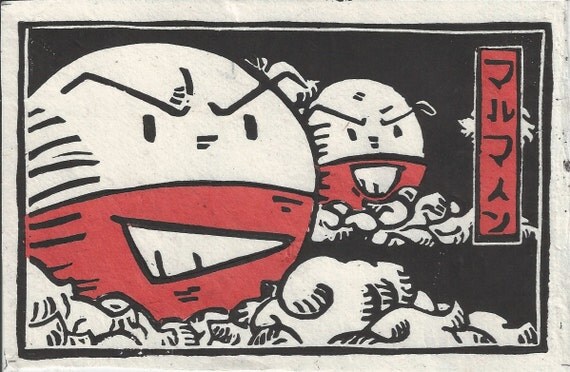
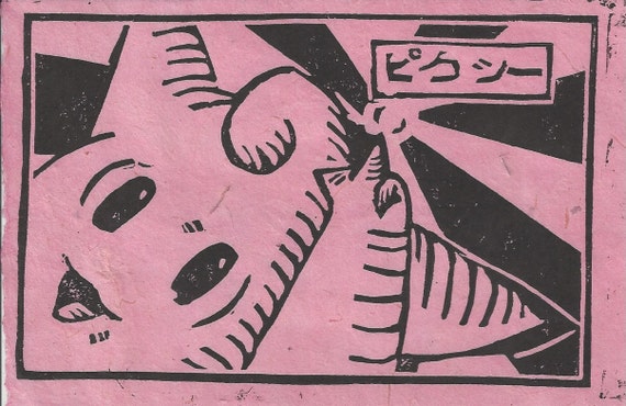
Switching topic, I have a stall coming up in November and I am focusing on making things that are reproducible in order to keep the balance between my stall and uni work. So far I have come up with the idea of doing lino prints, I had a little look on etsy to see if anyone does pop culture inspired lino prints and found one person by the name of Chase or TheBeardedGoldfish as the shop name is called.
If there is one thing in this world I love, it is Pokemon. And Chase does very unique Pokemon lino prints (if only he shipped to the UK). I have always loved the bold look of lino prints. 

He prints them on to rice paper of different colours depending on the character in the print.
I think the boldness of a lino print would look absolutely amazing paired with a vivid watercolour background that I have recently been creating with Dr Ph Martins concentrated watercolours.

This is also something I would love to experiment with for 'Outside The Penthouse'. Maybe I could even bind them into a zine format.


Monday, 4 May 2015

Brighter city project reflection

In this post I am going to reflect on my tales of the city project I have dubbed the #Brightercityproject, for this project I made teru teru bozu's which translates to shine shine monk in Japanese which are traditionally made out of white paper or cloth and resemble ghosts. The cloth or paper dolls are considered amulets that bring good weather (or rain if hung upside down) and were/are commonly used by farmers trying to insure the correct weather conditions for their crops. They started becoming pouplar for urban dwellers in the edo period, Traditionally if the weather is indeed good the day after the teru teru bozu is displayed then eyes would be drawn on them, this is comparable to the Japanese tradition of the daruma in which you have a daruma statue you draw in one eye when you have made your wish and draw in the second eye when the wish has been completed. So I made the teru teru bozu as a metaphor for bringing happiness and I tried to achive this by leaving encouraging messages and words of wisdom on pieces of card hung from the teru teru bozu.

So was the project a success? Short answer not from what I can tell. I attached a hash tag #Brightercityproject to the teru teru bozu but nothing has come up when I search that tag.

Do you think there is something you could have done to make the project more successful?
I could have made more and hung them in more heavily occupied places but I got too nervous to hang them in densely populated places. I liked what I did though putting them in less traveled places quite a few in darker corners of alleyways and places like that because it seemed more apt and like it made more of a statement.

I also made a video of all of the places I put them and hoping people can see by the video why I decided to place each message in the place I had put them. I am not disappointed with the outcome of this project in a strange way part of me didn't want to gain from it more than I have done by taking pictures and drawing from my inspiration to do this. It was supposed to be a selfless act if I got too much back from it, it wouldn't feel selfless anymore.

If I was to do it again what would I do differently?
I would probably think more about the construction because the string even though it looked pretty was so hard to get to work and on one of the teru teru bozu it kept coming undone. Apart from that I am satisfied with how the project went.

Summer project idea + artist influence

I don't know if it has changed but I was told the summer project would be on collections, one of my collections is ball jointed dolls today I had an idea about trying to make my own in a way I have never seen done before. The idea is I would "sculpt" the doll by needle felting and I was thinking of a type of character that would fit the needled felted look and I was reminded of the idea of anthro characters.

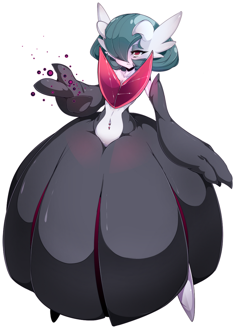
An artist who does great monster/antro characters is slugbox most of his work isn't suitable. But I really admire how he does chunky characters and I think that Kind of form would be really interesting to experment with when needle felting.

I particularly like his Pokemon anthro's because of how much Pokemon has inspired my work over the years.

If you are brave enough to see more of slugbox's work (I would recommend making sure the mature content filter is on) you can find his work on deviantart.com.

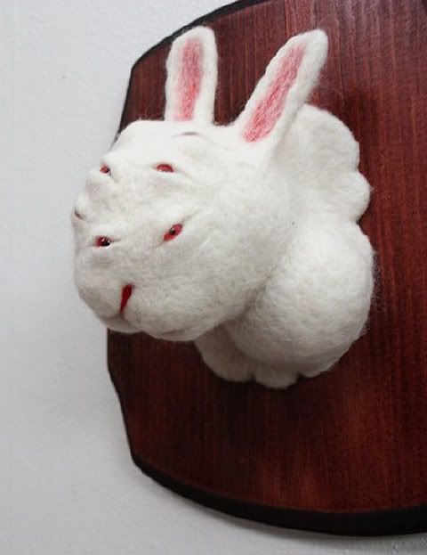
I recently found an artist on Instagram going by the name of  Zoe Williams @x03
She makes needle felted sculptures, they are very minimalist and she makes such amazing eyes for them.
She make's taxidermy style busts they range from the more conventional to the more mutated like this rabbit with many eyes.

I would really like to explore this idea if the project permits it.


Book review: The art of Howl's Moving Castle

I am a huge fan of Studio Ghibli and my friends have helped me build up my collection of Studio Ghibli art books by buying me them for Christmases and Birthdays.

So The Book I will be talking about today is The Art Of Howl's Moving Castle. It is a collection of Sketches, illustrations, concepts, backgrounds and character design from the making of the film.  
Part one of the book shows Hayao Miyazaki's concept sketches, unlike western film directors Japanese film directors more specifically those dealing with animation are expected to draw concepts and the storyboards for the film before passing them onto other artists.


Hayao Miyazaki's concept sketches are normally pen and watercolour or pencil and water colour. Some are vague some are detailed.

"Howl's Moving Castle is set in a world conceived by late 19th century European neo-futurist painters where magic and science co-exist."


"On a research trip for Miyazaki's new film Howls moving castle. The staff visited Europe for 12 days and, although their research centered on the eastern province of Alsace in Francewhere the film was set, they also spent time in Heidelburg (Germany), and Paris, Visiting the Alsatian city Colmar for its colour and atmosphere proved to be a productive experience for the staff.  


A drawing of one of the scenes from the film.

In the film there is a parade going on which seems to be based around the military, People are waving flags and having a good time. 

The main protagonist Sophie is cursed by the witch of the wastes turning her into a 90 year old woman, she flees the hat shop where she was apprenticing under her step mother, and stumbles across howls moving castle.  


 Some storyboards drawn by Miyazaki as you can see they vary from detailed to rough sketch.

Part two of the book is all about character design finalizing concepts and what went into each part of the film.


Concept drawings of howl's castle.


Concepts for 18 year old Sophie (pre-curse)

Concept are for The Hatter's House at night (the hat shop).

This is how it looked in the film.

Grandma Sophie concepts, there was a lot of thought put into older Sophie's appearance.
"I was determined to make the aged Sophie look, cute, but I had to dismiss that approach almost imminently. She simply wouldn't look old without her skin being wrinkled and blemmished. She might appear plain, but I made sure she would have the appeal of a refined old lady."   

Michiyo Yasuda discusses the subtle changes in colour through out the film to convey emotions.  


Howl's room concept 

Howl's room in the film

 Howl's room (cave) concept 
 Howl's room (cave) in the film

Part three is a write up of the screenplay/script. It shows all of the characters lines and how they are supposed to be spoken any calls to action the voice actors might need to convey the lines correctly. It's really quite fascinating to look at.

Saturday, 2 May 2015

Book cover research for Alice's Adventures in Wonderland and Personal Project

Since I would have to do book cover research for two projects I thought I would post it all in one chunk rather than two separate posts.

I am not sure who the artist of this cover is but this is the Japanese cover created in 2009, I was drawn to the cover because of the flat colour style which is something I have tried in my work before.

Hugh D’Andrade’s pink, leather-bound Alice's Adventures in Wonderland is very eye catching I love the black and pink together I think it really stands out. The limited amount of gold is also aesthetically pleasing. The cover is very bold and something I would definitely pick up out of interest.
Images from flavorwire.com


This cover by Sophie Douglas really helped inspire the more handcrafted feel I went with in my Alice's Adventures in Wonderland. I really love the lino cut look of this cover it wasn't the look I wanted to go with but it was the rough and readiness about it that I was drawn to.


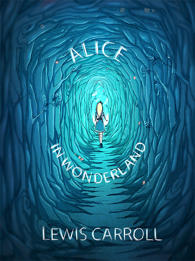
This is not an offical cover but this design by pannucabaguana on deviantart, I really liked the blues they used in this cover concept  and I also thought the font fit nicely with the aesthetic.

Image from deviantart.com


I found the cover for this book very creative I just had to mention it because it is simple but absolutely genius. 

Image from flavorwire.com 


These are some beautiful book covers for Ian Fleming's James Bond, I absolutely love these covers, the colours the women's expressions and how they fit together as a series.

Image's from littlegoldpixel.com


I also looked at some comics, indie comics and zine covers to get an idea for my personal project.

This cover from the indie comic Godkiller has a wonderful colour scheme it is limited but very eye catching the comic is post-apocalyptic and I definitely get that vibe from the cover alone.
Image from www.wired.com


Nurse Nurse by Kate Skelly has a very simplistic style that isn't seen much in indie comic's, the simplicity of this cover is what drew me to it. The cover has an even more limited colour pallet than Godkiller looking at how effective the two covers where made me want to experiment with limited colour.

Image from bitchmagazine


John showed me a Japanese manga called Uzamaki which was disturbing but had an interesting aesthetic.  


I went to the Salford Zine library earlier in the year, The visit really helped inspire me for both my Alice's Adventures in Wonderland and my personal project. The organicness of the drawings and type is what I really liked most.


Friday, 1 May 2015

I wish I had done this

There has been several artists that have really inspired me since the start of the course but Glenn Arthur has to be the one I go back to the most. I think it's that his main subject is women like me that draws me to his work, among his artwork their is also fan art of anime classics such as sailor moon and dragon ball. I tried my best to contact him for an interview but I got no response. It was very hard to choose one single piece of work of Glenn Arthur's I wish I had done because in reality I wish I had the skill to do all of them.

This was one of the first pieces of Glenn Arthur's work I saw and it is called Groundskeeper, so it is only apt I choose this one to talk the most about.

I love the detail in Glenn Arthur's work, the folds in her clothing the dappled appearance of the skull, the petals falling from the blooms on her dress and the detailing on the grave stones. Glenn Arthur does his work mostly in acrylic paint how he makes acrylic paint look almost air brushed is something which will probably always fascinate and boggle my mind in equal measure. He uses tiny brushes to achieve the flawless look of the paint. One thing I really love about this particular painting is her posture, it strikes me as very proud and I feel this when I look at Glenn Arthur's other paintings to. The motif of the strong proud woman that still retains a sense of fragility and grace. He paints the strange and the bazaar conjoined twins, bearded ladies, vampires and tattooed princesses. 

A motif that shows up in most of his pieces is a humming bird, if I had gotten an interview with him I would have asked him why the humming bird? I have my own theory however, humming birds are always close to starving because they have the highest metabolism of any bird a necessity in order to support the rapid beating of their wings during hovering and fast forward flight. To conserve energy when there is a lack of food hummingbird's go into a state similar to hibernation. Hummingbirds are continuously hours away from starving to death and are able to store just enough energy to survive overnight. My theory is that he includes hummingbird's to symbolize death or to symbolize making the most of life. In Groundskeeper you see both a skull and a hummingbird this leads me to think they might be juxtaposing each other the skull quite obviously representing death and the hummingbird to remind us of our mortality.

I love the expression on the girls face and the way he has painted her hair. I am normally one for vibrant colour pallets but the colour pallet Glenn has used in this painting is beautiful and gives an ethereal feel, there are other pieces that Glenn has done that exhibits much more vibrant colour pallets. The pink of her dress and the cream of her cloak really makes her stand out from her darker surroundings. The main elements are actually mostly grey with hints of blue in the headstones and yellow in the over cast sky.

The composition is quite standard with most of the key elements cantered in and towards the middle of the piece. The only thing I would have done differently if I would have painted this piece is I would make the gravestones in the background have different patterns/engravings rather than the same for all three. 

I don't think my working style will ever be anything like Glenn Arthur's and even though I love his work I wouldn't really want to pursue making work like his, I would feel like I would be ripping him off which I wouldn't want at all. I think I am satisfied with following his work and admiring the skill he has. I would one day really like to dive into painting with acrylics and maybe achieve that flawless look in my own style, I would also like to really start looking at the poses in which I draw my characters so I do can make my characters more fleshed out, for this I will have to look more into anatomy.

Thursday, 30 April 2015

1,2,3

This post is about three of the best pieces of advice I have been given since starting the course some of these will not be a piece of advice per say more of a turn in the right direction.

1. The zine making workshop

In the zine workshop I learned that working on pages which already had some preexisting texture or image on really help one overcome blank page anxiety or new sketchbook anxiety. I am someone who can get very hung up on their work and want every page to be perfect while in the zine the perfection is that it isn't perfect it has misspells, it has sketches done on lined paper, receipts, napkins, photocopies from things that inspired you through out. for me I think it is the perfect way to document and brainstorm (and kick a sketchbook buying addiction). There is something wonderful about making it yourself, selecting the papers and the binding. It's like having a little nugget of personality. Personally next year I want to do away with having sketchbooks and just bind my own zine style sketchbooks I think it really helped me with my process when it came to Alice's Adventures in Wonderland.

2. Be a flaneur

There are so many things you miss when you have your mind set on a destination, enjoy just taking everything in and being purposefully lost. I made another post called Ode to Manchester which really explains in depth what happened when I was being a flaneur in Manchester during my Tales of The City project. I class Manchester as my hometown over Salford and I was surprised by how much of Manchester I have never seen before despite spending a lot of time there over the years. What really grabbed me was how much of Manchester juxtaposes, I saw posh bars next to dingy alleyways and crumbling walls of old factories. Austerity and prosperity dwelling right next door to one another, I felt like if the bars could speak they would be gloating.

3. Don't be afraid to take on more than you can chew (sometimes)

I have a habit of doing very ambitious projects, I feel like a cat with nine lives just managing to pull through every time. The good thing about having ambitious projects is it keeps you engaged because you have to stay engaged or the project will crumble, it forces you to make use of all the time you have. It's stressful but seeing the final outcomes is a great feeling.

Sunday, 26 April 2015

Ode to Manchester

Salford maybe my "hometown" but I feel myself more strongly in Manchester. Today in order to find places to hang my #Brightercityproject Teru teru bonzu I just wandered. I went with my gut and what way peeked my interest, if you asked me to find the exact locations of where I hung the Teru teru bonzu I probably wouldn't be able to find a large number of them. It was fun to think of how long it might take people to find them hours, days, weeks...who knows. One thing I noticed while straying from the frequently traveled paths is that Manchester is a city of irony and juxtaposition. How so you may ask? A posh restaurant, bar or cafe next to an old abandoned building or a neglected alleyway. This was surprisingly a common sight. Austerity in the middle of abandonment. There were times where I felt threatened I walked down several streets and saw men staring me down. When I stumbled across a familiar route I felt comfortable and relieved. I have walked through the city many times but never like that. When I got lost in the city it would reduce me to tears, shear panic would rip through me I would feel helpless and small against the buildings and other people. The crowds would churn around me engulf me and drag me further from the path. Little did I know back then if I had just removed the path and aimed to just eventually stumble upon what I am looking for it could all be avoided. I didn't feel small, I didn't feel panicked, I felt like a tower, I felt confident and powerful somehow by relinquishing the control that was tied to I final destination. My goal was to wander and hang my signs and leave them behind and not look back and not care about what would happen to them afterwards. I noticed many things I wouldn't have noticed otherwise, a little boy walking with his mother and a friend through a seedy part of town carrying his toys with him. A wannabe gangster taking a piss in and ally next to an expensive bar. The only times I felt somewhat anxious is when people we watching me, cars drove slowly past me and when I was going to take a picture of where a homeless person sleeps (I got too anxious to actually take a picture). That is a lot less anxiety than I would normally have. This experience has been eye opening and I hope through this post and through the work itself it will be eye opening to others as well.

Tuesday, 3 March 2015

Personal Project: Choose your own ending

Before this project began I was in a comic book shop in Manchester called Travelling Man and my friends found a Batman choose your own adventure book. I have come across this concept before but it had never really inspired me, I also came across a comic by an artist I follow called Sophira-Lou and ended up buy it. I started to look at the indie comics in the store and came to the conclusion I could do it if I put my mind to it. The two ideas merged later that day and I decided I would propose it for my Personal Project.

My idea is to write 2-3 open ended stories and have other people decide what the ending should be. I would have my own ending I would keep a secret until the end. At first I wanted to send out physical zones but now I have thought about it I may do it via digital download.

I am buying two books I am hoping will help me with this project

How to Be an Explorer of the World: Portable Life Museum
Picture from www.farwakazmi.com
and 

The Imaginary World Of

Picture from www.groovinmoms.com

by Keri Smith

I'm also considering buying

Mess: The Manual of Accidents and Mistakes also by Keri Smith

I think these books will really help me with this project by loosening my creative muscles and help me think more open-mindedly about my project.

The purpose of my project is to help people understand how creativity can enrich your life via

  • Community projects and collaboration 
  • Creative achievement 

Choose your own adventure stories are commonly written in second-person so the reader can assume the role of the protagonist. But my story will follow a half monster called Grenade and how she deals with getting used to the human world.

Grenade in this story is based off a ball jointed doll I own, who's character I modelled after a character I created for a project back in foundation. (for more on bjd's take a look at my last post)

The series was based on a concept created by Edward Packard and originally published by Constance Cappel's and R. A. Montgomery's Vermont Crossroads Press as the "Adventures of You" series, starting with Packard's Sugarcane Island in 1976.

Picture from www.goodreads.com

Friday, 23 January 2015

Ball Jointed Dolls and How They Inspire My Work

So first off what is a Ball jointed doll or BJD?

A ball jointed doll is an articulated doll which was first made in Rome and Greece out of clay and wood, but the start of modern bjds started in France and Germany in the late 19th century. Today the market is dominated by Asian ball jointed dolls which are normally made out of polyurethane resin.

I own an Asian ball jointed doll. She is from a company called Angel Fantasy and her sculpt name is Alice. The name I gave her is Pandora I have had her for about 4 years now.


Why do I like bjds?

I got into bjds after stumbling across them on the internet while looking for manga and anime related artwork, I was taken a back by how stunningly detailed they were.

Bjds are fully customisable you can buy eyes, wigs, clothes, shoes EVEN eyelashes and you can paint their faces however you see fit (or have a face up artist do it for you). It is a great (but expensive )way of bringing a character to life. Since picking up the hobby I have noticed most people who partake in the hobby are artists and writers wanting a visual representation of their characters.

How are bjds influencing my representation of Alice's Adventures in Wonderland?

I thought dolls fit in rather well with the story and is the closest thing I have physically to an automation. And automations are the aesthetic I am going for with the characters, like the red queen, mad hatter and tweedle dumb and tweedle dee.

Monday, 12 January 2015

New year, new project

For our next unit we are entering competitions I have chosen to enter Pan Macmillan's Alice's Adventures in Wonderland. The goal is to create a book cover and at least 2 illustrated pages.

I have started to gather some inspiration on pinterest www.pinterest.com/raeldanger/alice-in-wonderland

Tuesday, 16 December 2014

Police Cadets and Ethical Issues

While doing the anti bullying animation I had to reconsider a lot of the content I wanted to cover. I wanted to focus on the aftermath of bullying which would be that kids who are bullied are at more at risk to mental health problems such as

Depression
Panic disorder
Anxiety especially Social Anxiety
Body Dysmorphia
Paranoia

and more
Serious cases of bullying have even lead to the victim taking their own life.

But due to the 10-11 age range it would not be suitable for them, I got around this by hinting at it by using metaphors in my animation.

Instead I made a zine that would be for the parents that would talk about some of these issues.

Monday, 8 December 2014

YouCanNow

My tutor Jo sent us this link to YCN magazine in an email so I decided to have a look through it, the video at the bottom of the page is what I want to review the most.

Michael Wolff talks about design (blogger doesn't seem to like vimeo)

What Michael Wolff said made me question my artwork. Michael says about how he thinks the feelings behind a piece of art and/or design and how it is communicated is what is important, I feel my work is very based off my own feelings and emotions but does that come across to the audience viewing my art. Does my art satisfy people are improve their life in anyway? It satisfies me but I'm not other people.

It definitely provided some food for thought.