Translate

Showing posts with label experiment. Show all posts

Thursday, 24 March 2016

Business card designs and considerations

I started thinking about my business cards back in February, I started by ordering a sample pack from Moo and deciding on their minicards. I loved the feel and look of the luxe minicards but because I wanted to attach a plush character (I call him Clarence) to the cards it would mean having to punch a hole. Even though I really like the luxe it would have probably been to thick to punch a hole through. So I ended up going for the original matte minicards.

Upon further feedback I have decided to match the characters bow to the colouring of the card design, and I have decided to only make 10 cards with plushies attached and to make sure the designs can hold their own.

First draft 

First Draft and Second Draft

Final Clarences (without bows)

For my final Clarences I switched the handmade pom poms out for pre-made ones, making the process a lot faster and the final outcome a lot neater.

For the cards I choose two designs from work I had already done, the design on the left was for my research project but the version put into my research project has been edited further to be a better fit. The second design is from my personal work and I added the purple to make the design fit in more with the other design.


Monday, 12 October 2015

Hand Lettering

Something I want to improve on this year is my hand lettering, tutors and other people have told me I have a natural nack for it. I am not into the technical ins and outs of typography but I do like my work when it includes hand lettering. In my recreational sketchbooks I like to sort of journal element, the work I do for myself is very much about what is going on in my life and how I am feeling. Some pages feature dairy style entries some just a phrase that sums up my day or how I am feeling in the moment. Sometimes it's just balls to the walls craziness that just rolls off the top of my head.


I want my work to have a more ziney feel, I like the spontaneous nature of it. I can collect, experiment more like that. One thing I don't like to see in my work is blank space, I like my work to be lively and I feel hand lettering really helps me fill in those blank spaces.

Some YouTube tutorials

How To DIY Modern Calligraphy
Hand Lettering Step By Step
Modern Calligraphy: Marcelle Lettering
Brush Script Lettering Basics This one is really helpful


Monday, 4 May 2015

Brighter city project reflection

In this post I am going to reflect on my tales of the city project I have dubbed the #Brightercityproject, for this project I made teru teru bozu's which translates to shine shine monk in Japanese which are traditionally made out of white paper or cloth and resemble ghosts. The cloth or paper dolls are considered amulets that bring good weather (or rain if hung upside down) and were/are commonly used by farmers trying to insure the correct weather conditions for their crops. They started becoming pouplar for urban dwellers in the edo period, Traditionally if the weather is indeed good the day after the teru teru bozu is displayed then eyes would be drawn on them, this is comparable to the Japanese tradition of the daruma in which you have a daruma statue you draw in one eye when you have made your wish and draw in the second eye when the wish has been completed. So I made the teru teru bozu as a metaphor for bringing happiness and I tried to achive this by leaving encouraging messages and words of wisdom on pieces of card hung from the teru teru bozu.

So was the project a success? Short answer not from what I can tell. I attached a hash tag #Brightercityproject to the teru teru bozu but nothing has come up when I search that tag.

Do you think there is something you could have done to make the project more successful?
I could have made more and hung them in more heavily occupied places but I got too nervous to hang them in densely populated places. I liked what I did though putting them in less traveled places quite a few in darker corners of alleyways and places like that because it seemed more apt and like it made more of a statement.

I also made a video of all of the places I put them and hoping people can see by the video why I decided to place each message in the place I had put them. I am not disappointed with the outcome of this project in a strange way part of me didn't want to gain from it more than I have done by taking pictures and drawing from my inspiration to do this. It was supposed to be a selfless act if I got too much back from it, it wouldn't feel selfless anymore.

If I was to do it again what would I do differently?
I would probably think more about the construction because the string even though it looked pretty was so hard to get to work and on one of the teru teru bozu it kept coming undone. Apart from that I am satisfied with how the project went.

Saturday, 2 May 2015

Book cover research for Alice's Adventures in Wonderland and Personal Project

Since I would have to do book cover research for two projects I thought I would post it all in one chunk rather than two separate posts.

I am not sure who the artist of this cover is but this is the Japanese cover created in 2009, I was drawn to the cover because of the flat colour style which is something I have tried in my work before.

Hugh D’Andrade’s pink, leather-bound Alice's Adventures in Wonderland is very eye catching I love the black and pink together I think it really stands out. The limited amount of gold is also aesthetically pleasing. The cover is very bold and something I would definitely pick up out of interest.

Images from flavorwire.com


This cover by Sophie Douglas really helped inspire the more handcrafted feel I went with in my Alice's Adventures in Wonderland. I really love the lino cut look of this cover it wasn't the look I wanted to go with but it was the rough and readiness about it that I was drawn to.


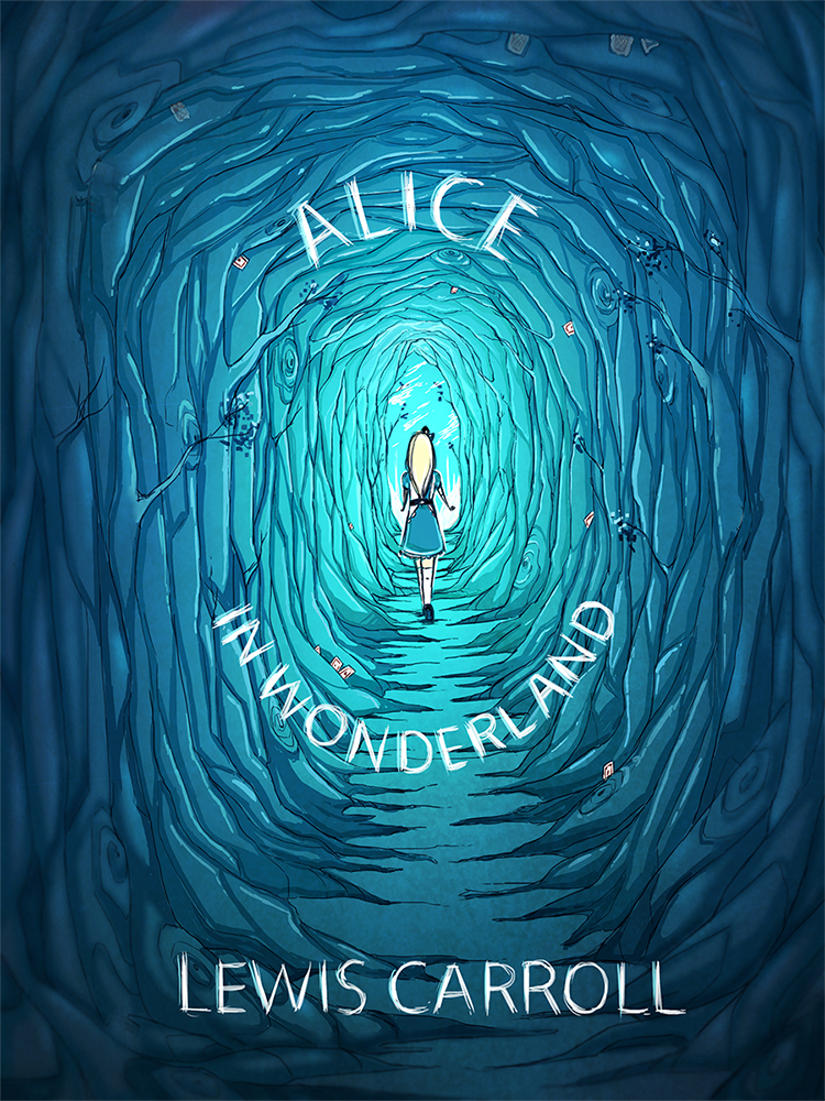
This is not an offical cover but this design by pannucabaguana on deviantart, I really liked the blues they used in this cover concept  and I also thought the font fit nicely with the aesthetic.

Image from deviantart.com


I found the cover for this book very creative I just had to mention it because it is simple but absolutely genius. 

Image from flavorwire.com 


These are some beautiful book covers for Ian Fleming's James Bond, I absolutely love these covers, the colours the women's expressions and how they fit together as a series.

Image's from littlegoldpixel.com


I also looked at some comics, indie comics and zine covers to get an idea for my personal project.

This cover from the indie comic Godkiller has a wonderful colour scheme it is limited but very eye catching the comic is post-apocalyptic and I definitely get that vibe from the cover alone.
Image from www.wired.com


Nurse Nurse by Kate Skelly has a very simplistic style that isn't seen much in indie comic's, the simplicity of this cover is what drew me to it. The cover has an even more limited colour pallet than Godkiller looking at how effective the two covers where made me want to experiment with limited colour.

Image from bitchmagazine


John showed me a Japanese manga called Uzamaki which was disturbing but had an interesting aesthetic.  


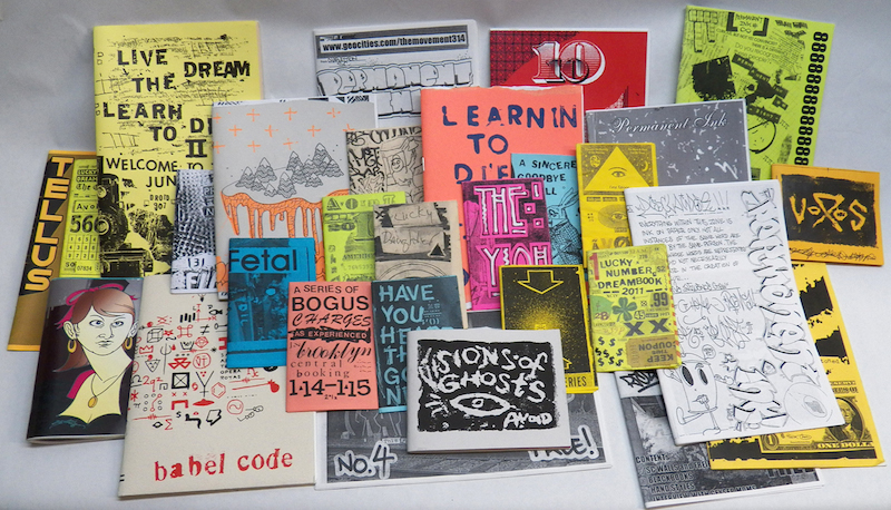
I went to the Salford Zine library earlier in the year, The visit really helped inspire me for both my Alice's Adventures in Wonderland and my personal project. The organicness of the drawings and type is what I really liked most.


Friday, 1 May 2015

I wish I had done this

There has been several artists that have really inspired me since the start of the course but Glenn Arthur has to be the one I go back to the most. I think it's that his main subject is women like me that draws me to his work, among his artwork their is also fan art of anime classics such as sailor moon and dragon ball. I tried my best to contact him for an interview but I got no response. It was very hard to choose one single piece of work of Glenn Arthur's I wish I had done because in reality I wish I had the skill to do all of them.

This was one of the first pieces of Glenn Arthur's work I saw and it is called Groundskeeper, so it is only apt I choose this one to talk the most about.

I love the detail in Glenn Arthur's work, the folds in her clothing the dappled appearance of the skull, the petals falling from the blooms on her dress and the detailing on the grave stones. Glenn Arthur does his work mostly in acrylic paint how he makes acrylic paint look almost air brushed is something which will probably always fascinate and boggle my mind in equal measure. He uses tiny brushes to achieve the flawless look of the paint. One thing I really love about this particular painting is her posture, it strikes me as very proud and I feel this when I look at Glenn Arthur's other paintings to. The motif of the strong proud woman that still retains a sense of fragility and grace. He paints the strange and the bazaar conjoined twins, bearded ladies, vampires and tattooed princesses. 

A motif that shows up in most of his pieces is a humming bird, if I had gotten an interview with him I would have asked him why the humming bird? I have my own theory however, humming birds are always close to starving because they have the highest metabolism of any bird a necessity in order to support the rapid beating of their wings during hovering and fast forward flight. To conserve energy when there is a lack of food hummingbird's go into a state similar to hibernation. Hummingbirds are continuously hours away from starving to death and are able to store just enough energy to survive overnight. My theory is that he includes hummingbird's to symbolize death or to symbolize making the most of life. In Groundskeeper you see both a skull and a hummingbird this leads me to think they might be juxtaposing each other the skull quite obviously representing death and the hummingbird to remind us of our mortality.

I love the expression on the girls face and the way he has painted her hair. I am normally one for vibrant colour pallets but the colour pallet Glenn has used in this painting is beautiful and gives an ethereal feel, there are other pieces that Glenn has done that exhibits much more vibrant colour pallets. The pink of her dress and the cream of her cloak really makes her stand out from her darker surroundings. The main elements are actually mostly grey with hints of blue in the headstones and yellow in the over cast sky.

The composition is quite standard with most of the key elements cantered in and towards the middle of the piece. The only thing I would have done differently if I would have painted this piece is I would make the gravestones in the background have different patterns/engravings rather than the same for all three. 

I don't think my working style will ever be anything like Glenn Arthur's and even though I love his work I wouldn't really want to pursue making work like his, I would feel like I would be ripping him off which I wouldn't want at all. I think I am satisfied with following his work and admiring the skill he has. I would one day really like to dive into painting with acrylics and maybe achieve that flawless look in my own style, I would also like to really start looking at the poses in which I draw my characters so I do can make my characters more fleshed out, for this I will have to look more into anatomy.

Thursday, 30 April 2015

PDP Interview #3 with Jenni Illustrations

Interview with Jenni Illustrations


Jenni is an artist from Australia, I aspire to be as successful as she is. She sell's her work on clothes, posters, playing cards, stickers and the list goes on. I chose to interview her because she is very much inspired by the same things I am and despite the common interests our styles are very different.

Q1. I can see a definite anime/manga influence in your artwork is there anything else that inspires how you work? I think seeing other artist with the same style influence me. Anything cute and colourful/bright. Living and having kawaii things also influence me and my work.


Q2. What advice would you give someone who wants to sell their work at conventions/events? Having motivation and passion for your work is something you need. Loving your work and making other people love your work is another. Also knowing what people really like is something to think about. eg, whats your target audience? what will they be attracted to


Q3. If you could experiment with any medium you want what medium would you choose? I like pen work and watercolour. I always draw digitally but there's times I just want to get away from the computer and free myself with some traditional mediums. 


Q4. Do you prefer having lots of little projects on the go or one big project? I like either really. sometimes mostly my little projects is really related to my big project. eg: my original character in diff drawings(small project) while big projects is like having them on clothes, products, animation.


Q5. Do you ever have problems with motivation, if so how do you keep yourself motivated? I do a lot of the time. (I'm sure no one can tell) haha. I get a lot of inspiration from looking at things. everyday life around me, music I listen to ( every day, all day till night I listen to music) keeps me sane lol Having you guys ( my followers and friends) who enjoys my drawings keeps me motivated. who cares about my work. who wants to share my work/talk about me all over the world is one thing I really appreciate keeps me going =]


Find more of her work here

1,2,3

This post is about three of the best pieces of advice I have been given since starting the course some of these will not be a piece of advice per say more of a turn in the right direction.

1. The zine making workshop

In the zine workshop I learned that working on pages which already had some preexisting texture or image on really help one overcome blank page anxiety or new sketchbook anxiety. I am someone who can get very hung up on their work and want every page to be perfect while in the zine the perfection is that it isn't perfect it has misspells, it has sketches done on lined paper, receipts, napkins, photocopies from things that inspired you through out. for me I think it is the perfect way to document and brainstorm (and kick a sketchbook buying addiction). There is something wonderful about making it yourself, selecting the papers and the binding. It's like having a little nugget of personality. Personally next year I want to do away with having sketchbooks and just bind my own zine style sketchbooks I think it really helped me with my process when it came to Alice's Adventures in Wonderland.

2. Be a flaneur

There are so many things you miss when you have your mind set on a destination, enjoy just taking everything in and being purposefully lost. I made another post called Ode to Manchester which really explains in depth what happened when I was being a flaneur in Manchester during my Tales of The City project. I class Manchester as my hometown over Salford and I was surprised by how much of Manchester I have never seen before despite spending a lot of time there over the years. What really grabbed me was how much of Manchester juxtaposes, I saw posh bars next to dingy alleyways and crumbling walls of old factories. Austerity and prosperity dwelling right next door to one another, I felt like if the bars could speak they would be gloating.

3. Don't be afraid to take on more than you can chew (sometimes)

I have a habit of doing very ambitious projects, I feel like a cat with nine lives just managing to pull through every time. The good thing about having ambitious projects is it keeps you engaged because you have to stay engaged or the project will crumble, it forces you to make use of all the time you have. It's stressful but seeing the final outcomes is a great feeling.

Sunday, 26 April 2015

Ode to Manchester

Salford maybe my "hometown" but I feel myself more strongly in Manchester. Today in order to find places to hang my #Brightercityproject Teru teru bonzu I just wandered. I went with my gut and what way peeked my interest, if you asked me to find the exact locations of where I hung the Teru teru bonzu I probably wouldn't be able to find a large number of them. It was fun to think of how long it might take people to find them hours, days, weeks...who knows. One thing I noticed while straying from the frequently traveled paths is that Manchester is a city of irony and juxtaposition. How so you may ask? A posh restaurant, bar or cafe next to an old abandoned building or a neglected alleyway. This was surprisingly a common sight. Austerity in the middle of abandonment. There were times where I felt threatened I walked down several streets and saw men staring me down. When I stumbled across a familiar route I felt comfortable and relieved. I have walked through the city many times but never like that. When I got lost in the city it would reduce me to tears, shear panic would rip through me I would feel helpless and small against the buildings and other people. The crowds would churn around me engulf me and drag me further from the path. Little did I know back then if I had just removed the path and aimed to just eventually stumble upon what I am looking for it could all be avoided. I didn't feel small, I didn't feel panicked, I felt like a tower, I felt confident and powerful somehow by relinquishing the control that was tied to I final destination. My goal was to wander and hang my signs and leave them behind and not look back and not care about what would happen to them afterwards. I noticed many things I wouldn't have noticed otherwise, a little boy walking with his mother and a friend through a seedy part of town carrying his toys with him. A wannabe gangster taking a piss in and ally next to an expensive bar. The only times I felt somewhat anxious is when people we watching me, cars drove slowly past me and when I was going to take a picture of where a homeless person sleeps (I got too anxious to actually take a picture). That is a lot less anxiety than I would normally have. This experience has been eye opening and I hope through this post and through the work itself it will be eye opening to others as well.

Monday, 20 April 2015

Doll test how ingrained is racism?

I just watched this video and the video really made me feel uneasy, which I think is what it is supposed to do.

This video is entitled Doll Test and in the video the people conducting the experiments ask children from varying racial backgrounds questions about two dolls and a diagram with different skin colours. What really pulled at my heart stings was watching the children of colour pointing to the "black" doll and labeling it as the ugly doll, with most preferring the white doll. And when asked to give the researcher the doll which looked like them they handed over the "black" doll which they had earlier categorized as the ugly doll.

The fact they considered a doll with a similar skin colour ugly just shows how much the stereotypes made by white people have been rooted within coloured children. I felt tears come to my eyes several times no child should think that their skin colour makes them ugly or untrustworthy.

Sunday, 15 March 2015

PDP Interview #1 with Jellie Bee

I first discovered Jellie Bee via her YouTube channel after buying some of her artwork I had the pleasure of meeting her at Japan Day 2014 in Manchester. Since Jellie Bee is influenced by very similar things to me I thought she would be interesting to interview.


1. You're work looks anime/cartoon influenced; did standing out from the crowd ever cross your mind when you were developing your style?

Actually, when developing my work, I actually wanted to have my work look more like everyone elses, particularly successful artists. However, people started to compliment me on the fact my work was really recognisable to them and that's when I realised being myself was easier and better all along.

One of Jellie Bee's digital paintings, she often does these on a single layer.


2.When did you start selling your artwork and how long did it take you to build a steady amount of people who buy your work?

I started selling my artwork on stickers from around early 2010 and it picked up quite quickly. I started my own online store in 2011 but it took until 2013 for it to become a lot more steady. Convention selling has kept the interest in my online store going strong.

 3.What is the most interesting medium and/or canvas you have ever worked on?

My absolute favourite canvas is the sketchbooks that I customise. There's a real sense of achievement when I've finished one, because it's original art, but also a useable product. I find it interesting every time, as they always come out more special than I expected.

One of Jellie Bee's custom sketchbooks she sells on storenvy, she sells some pre-made and is often commissioned to do custom designs. 


4. What are your favourite artists? Have they influenced your style?

Massively so. My favourite artists are Lois van Baale (Loish); Marc Brunet (bluefley/Cube Brush); Mary Blair and Victoria Ying.
Each one has inspired me in different ways: Loish represents the skill levels I've always wanted to reach; Marc Brunet's techniques have always pushed me, his tutorials improve me in a way no-one else's ever have. Both of these artists pushed me to try single-layer painting, colour experimentation and portraiture and even though my painting skills are lightyears away, they've helped form who I am today with my digital art.
Mary Blair and Victoria Ying represent the illustrative side to my work, the side I find more relaxing and easier, but also the side I tend to criticise more.


 5. Do you feel your style is still developing?
Oh, always. I had a funny conversation with someone in a livestream recently, who said they felt comfortable with their digital style after only two weeks of experimentation. I said that it's taken me 9 years to become comfortable with my approach and to have more pride in my work. I started in Dec 2005 and it wasn't until Dec 2014 that I really felt connected. It will always develop, because I'm always torn between sticking to one style - painting, or illustrative?
Not only that, but I also like to practice with sumi-e and ukiyo-e style art a lot, so there's a third style I like to do. It's so confusing sometimes, but I'm happy right now with the progress I'm making. I'm just excited to see how I improve over the course of my life!


Want to check out Jellie Bee for yourself?
Here are some of the places you can find her.

Art Facebook Page

Business Facebook Page

Storenvy