Translate

Showing posts with label Art. Show all posts

Saturday, 23 April 2016

Final show considerations

I've been thinking more on how I want to brand myself, while looking at places to get my work printed I stumbled across dStudio which is a printing and framing service which offers bamboo paper which is more environmentally friendly www.digitalprintdesign.co.uk/papers/. 

There is also a 20% discount on getting your work printed on Hahnemuhle Bamboo 290gsm paper which is a nice incentive. It says on the website it is especially good for vibrant colours so it should be perfect for my work. 


Visiting Practitioners: Group portfolio feedback

On 20/04/2016 I went to Cake and Doodle and asked if any of the illustrators there could take a look at my portfolio and give me a bit of feedback. Most of my feedback came from Luis Gainzarain who is a Graphic Designer and comic artist from spain and Marta Gonzalez 
Luque who is a freelance photographer who also dabbles in illustration and animation.


Feedback from Luis Gainzarain
You should think a bit on the Why? What? and Where?

Why do you do the work you do? Is it self expressive? Does it have a message? Are you pursuing a stylistic ideal?

What are you going to do to convey what your work is about? What form will best convey what your work is about? What audience do you need to market your work to? (Who will appreciate what it is about).

Where can your artwork go? Where is your audience going to be? Where will your work be seen by the right people?

There isn't a right or wrong answer to these questions you just need to know what your answers are so you can take a step in the right direction.

Reflecting on the feedback
For why I create my work I would say it is primarily self expressive but I would also say I was pursuing a stylistic ideal but I have gotten to a place where I am happy with my style but I still like to play with different mediums it keeps my work fresh and exciting. 

Not all my work has a message behind it and I've come to terms with that. I think in the illustration world right now creating decorative work is frowned upon and seen as fluff in a way. But maybe I just want to create bright and cheerful work sometimes that doesn't particularly have a hard hitting message behind it, I don't think it is wrong to do. There is a Japanese principle called "ma" and I think ma can explain why I do my work the way I do. Ma is the space inbetween the action, if you want to see ma in practice Studio Ghibli is a great example. So my work which is mostly for decoration is my ma as you will, it is the break I need from my hard hitting work. In terms of studio ghibli ma comes after important parts of the story to help the information sink in and to transition to the next plot point. Ma comes in the form of mundane details for example a girl has a hard day at school lots of bizarre things happen. The ma could be she goes home and runs a bath and just goes about her normal routine before she is thrown into the next set of ordeals.

 But I do also create work that does have meaning to it, I mostly focus on mental health and opening up that conversation and making the whole subject less taboo. That work is often very introspective and it takes a lot of energy to translate it into an image.


The what for me it to make prints, to make stories and t-shirts, I basically want to make the topic of mental health as accessible as possible. The more people are exposed to it the easier it becomes to talk about it. And I want to approach my decorative work in the same way, if someone wants to wear my designs doesn't want to wear a t-shirt about mental health instead they want something a bit lighter in tone I can also supply my customers that option. My main audience is 13-25 I think the younger end of my audience will like my work for it's style and the older end will appreciate the message behind some of my pieces.


I think in terms of where I could sell or display my work I think there is quite a few pathways I can explore. Comic conventions are where I have had the most success up till now and I think with me producing t-shirt they are going to continue to be one of the best places to sell. I've had varying levels of success when it comes to selling my work locally, children and teenagers are my main buyers when I sell locally. I have recently started to see a raise in street artists taking an interest in my work and I feel like paste up's might be a good way to reach that audience. I think selling my work online could work if I concentrate on actively advertising, as of now I have had no success with it but I think that is all down to me not giving my etsy and redbubble enough exposure.


Marta Gonzalez
Sometimes you need to experiment with platforms and what you are creating, the best thing you could do is just try things to see what is a viable option or not. And I would recommend just getting a regular job first because it helps you develop as a person and helps you gain confidence.

(when I mentioned Fig Taylor and her feedback regarding my work) Even professionals can give bad advice sometimes, just because one person tells you something won't work for you doesn't mean they are right. I don't see why you couldn't do editorial illustration for more alternative magazines. Don't let one person tell you what you can or can't do.

What might be unpopular now might be popular next week or next month, trends change so don't base your decision on where you want to go with your work on what is popular right now. What is selling now might fade out of fashion in a few months, what has faded out of fashion a few mouths or years ago might have a resurgence. If it is selling even if it's not selling much keep doing it, if it isn't selling at all that's when you need to consider shaking things up a bit. Just keep doing what you love doing and keep developing it.

Reflecting on the feedback
I think Marta really helped me realise that just because my style isn't popular with art directors at the moment it doesn't mean it never will, and maybe it's not worth worrying about how popular or unpopular my style is. Sometimes you just need to go with the flow.


Other thoughts
When I mentioned Fig Taylor I quickly found the people who did know of or have encountered her have a rather low opinion of her. One woman said when she was a student Fig Taylor gave her feedback and she said it was useless to her and ended up being completely off. She said Fig had been out of the industry for too long and didn't really have much of a grasp on what is currently popular. and to take what she had to say about my work and what direction I should take it with a pinch of salt She also said Fig was the one approaching universities to do these feedback sessions not the otherway round which it's a very good sign. 

Sunday, 17 April 2016

Client: Hang-Up Gallery Director Ben Cotten

The hang up gallery prides itself on helping young artists, and with big names like Banksy on their roster of artists who wouldn't want these guys to look at your work. In this email I'm trying to hard sell my work a bit more while still remaining professional and polite.

Dear Ben Cotten,

I'm Sophie a BA Illustration student in my final year at MMU. As part of our course we have been asked to seek out industry professionals which may be interested in our work. I have attached a PDF portfolio to this email it contains 6 pieces of my best pieces work. If you could spare a moment to look at it and give me some feedback it would be much appreciated.

You have an amazing selection of artists such as Takashi Murakami, Invader, Dsceet, Herakut and of course Banksy. And by looking through your roster of artists I feel like my work may interest you, it's in the same vein but at the same time something a little different. Just to make clear I'm not looking to display my work only for you to have a look and see what you think.

I eagerly await your response.
Sophie Stratton (RaelDanger)


I will update this post if/when I get a response.

Wednesday, 6 April 2016

Client List part 2

So thinking further into my artwork and how it fits into the industry I have decided Art Directors are the wrong people for me personally to be going to. A lot of them are quite adverse to hiring anyone with a manga influenced style. So the next port of call is small independent gallery owners.

Richard Goodall Gallery

I have visited this a gallery in person and felt like my work would fit in with the other artists work. They display one of my favorite artists camilla d'errico who has inspired me a lot through out my degree.

Gallery owner Richard Goodall


Nottingham Contemporary

Looks to display a variety of work on their about us section  they say "We work to attract new, diverse audiences to contemporary art through innovative educational activities, our communications and our events." and that "Our audience is relatively young – around 50% are under 35" which is around the demographic I am aiming at.

Sam Thorne Director


ascot studios

As soon as I looked on the website I saw a manga inspired piece of artwork under the category of urban art.

Gallery Director Phil Harwood

From the website "Phil writes for a number of Arts & Culture Magazines, curates the exhibitions held at the gallery, and represents over 20 artists – including established international painters, mid-career artists & talented emerging artists based in the North West of England. Having gained the respect of international collectors and with an impressive client list here in the United Kingdom, Phil has earned his reputation as one of the most influential and successful art dealers of his generation."

Hang-Up

After searching for urban art galleries this gallery popped up and the art they display seems to be in line with what I do "an East London based contemporary art gallery located in the vibrant and bohemian neighbourhood of Stoke Newington. The gallery presents a dynamic exhibition program of fresh and forward thinking work from our roster of artists, photographers and makers. We show both young artists at the early stages of their careers alongside established names from the art world. We tie it together by seeking out and showing only those who are inherently creative, artists whom in some way break the mould from the traditional, pushing the boundaries either in terms of their work, their message or both."

Gallery Director Ben Cotten 


Upfest Gallery

"Situated on North Street, Bedminster is Bristol’s longest running urban art gallery, with the largest range of spray paint colours and Posca paint pens in Bristol. With regular exhibitions from some of the top Bristol, UK and International graffiti and street artists, the Gallery offers Bristol’s widest selection of Urban, Illustration and Contemporary artwork alongside a bespoke framing service, limited run artist t-shirts, and a fine selection of Street Art, Graffiti & Bristol books." The upfest gallery is another possibility especially since I am considering getting into selling t-shirts.

Gallery and festival Director and Founder Stephen Hayles


Identity Manchester

I have always wanted to branch out into t-shirt design since my A-levels when I printed a t-shirt (via  Identity Manchester) for one of my final pieces. I feel the time has come to revisit Identity Manchester. The owner Leo is a friend of my Dads and for what he doesn't have in qualifications in design he more than makes up with his experience.

Even though a bit unorthodox my Dad sent Leo an email on my behalf he didn't discuss this with me prior otherwise I would have contacted him myself. 


Will definitely looking into more ubran art galleries to contact.

Thursday, 18 February 2016

Cake and Doodle 17/02/16

After the Chris Madden, Barney Ibbotson and Emma Reynolds talk (which will be detailed in my next post) I looked into Draw Northwest and some of the other artistic gatherings which take place in Manchester, this lead me to Cake and Doodle.

This week I decided I would attend the Cake and Doodle gathering. It takes place every Wednesday at Ziferblat on Edge Street at 7:30pm, Ziferblat is a unique venue in the fact that tea, coffee, cake, soft drinks, juice, biscuits, cereal etc is free you are charged based on how much time you spend. The rate is 6p a minute so that's £3.60 an hour. So if you are planning on attending keep in mind you will be charged for your time spent.

The gathering is a good way to make industry contacts in fact one of the women who attended works with Emma Reynolds. It's a very open environment and you will often be asked what you are working on and given advice and critique if you express you are open to it. It's a very relaxed and friendly atmosphere. And in addition it's a great way to find out about exhibitions and events around Manchester and it isn't just limited to illustration. Through this weeks Cake and Doodle I learned about O!PLA 2015 which is a night of polish animation on Friday 4th March 7:30 -9:30pm at Ada house, 77 Thompson Street, Manchester. It requires a ticket since seats are limited.

I would definitely recommend attending Cake and Doodle not many attend every week so just come along if you happen to have a free evening.

Tuesday, 9 February 2016

Gallery Visit: Richard Goodall Gallery

Yesterday I visited the Richard Goodall Gallery in Manchester. I was really impressed by the work on display and I could see my work fitting in there. They sold work from a range of artists and my parents ended up purchasing a print.

I discovered two new artists the first being Jay Ryan.

Jay Ryan is an American artist specializing in screen printed posters for rock bands and concerts. I love the quirkiness of his characters, they are cute but not overly cute and it inspires me that he has actually produced artwork for bands and he has even produced album artwork and track illustrations. Being a big fan of music I would love to produce work for bands.


The second artist I discovered goes by the name of Daniel Danger.
Daniel Danger is based in the New England region of America, I love his use of colour and the subject matter of his work. I have recently discovered that I find old abandoned buildings absolutely fascinating so his work instantly appealed to me. His work is almost akin to documentation, you will find many urban explorers love to document abandoned buildings before they get demolished and are gone for good. By the looks of his instagram @tinymediaempire he does dabble in urban exploration. 


Wednesday, 27 January 2016

Feedback from Fig Taylor

Yesterday Fig Taylor came in to have a look at out work and suggest directions we could go in.

First she gave a talk on finding clients. She talked about having a strong style with diverse subject matter is what art directors might look for in a portfolio, if an art director can't see in your portfolio you draw cats for example they won't hire you to draw cats. She warned us against buying mailing lists of clients and sending out generic copy and paste emails because it is a fast track to being blacklisted by those clients. She told us to only target clients who you think will be interested in your work, if you are contacting a client who is the wrong fit you are basically just wasting your time.

Fig talked to us about two different illustration pathways

Mainstream which is editorial which has a fast turnover, book publishing where your designs will be heavily shaped by the retailer, and advertising which is where you can make a lot of money but it has to go through a lot of people who will demand a lot of changes.

Gift industry which more about making products like greetings cards, wrapping paper and I assume things like t-shirts and apparel etc.


Fig's Feedback

After the talk she sat down with groups of us and gave us some quick feedback on where we could go with our work.

When she got to my work I couldn't help but feel she didn't know what to really suggest, she told me that art directors don't like manga influenced styles but she didn't know why that's the case because it is rising in popularity with consumers. So pretty much editorial would be hard for me to get into but there maybe some more quirky children's magazines like Aqila I could try. She kept wavering on if my style would be a good fit for children or would be better aimed a tweens and teens.

She suggested I could try and get into character design and if I was to include some of my roughs in my portfolio but otherwise stick with finished pieces. She also suggested I could try selling my work for tattoo flash.

Her biggest suggestion was for to try and sell my work online on sites like etsy and redbubble. But she also said hardly any artists get popular selling online.

My Thoughts

I don't think Fig Taylor seemed to grasp my work and it's audience. I have most success selling to people aged 11-25 yet Fig kept telling me my work was only for children, tweens and early teens. She didn't explicitly say I should go into the gift industry even though that seems to be the obvious best fit for my work. The whole experience was very de-motivating for me but I have to keep in mind my work is a bit out there and is very niche so I can't expect everyone to understand it.


Thursday, 12 November 2015

Doki Doki Festival

Saturday last week I sold my artwork at my first anime convention. DokiDoki before this year was held in Manchester every two years, but is now running every year in November.

This year was more of a trial run for me so I could see how others set up and what sells, it defiantly helped seeing how others dress there stalls and how I can improve on presentation. But I did manage to make nearly £70 (£69.50) to be precise which was a nice bonus.


I have a lot of friends in this community I had actually interacted with some of the other artists who were trading prior to the event. It was great to interact with my target audience properly for the first time, I got some great feedback on prices and what I should focus on in the future. 

I will defiantly be doing it again next year, it was a really enjoyable experience.   

Wednesday, 4 November 2015

Artist of interest Isabella Bunny Bennet

Isabella Bunny Bennet is an children's book illustrator and is also part of a steam punk band called Steam Powered Giraffe. In Steam Powered Giraffe Isabella plays the character Rabbit, who is a Victorian Robot who is prone to malfunctions.

I love her style it's very quirky, she incorporates texture into her digital pieces. This piece is called Bathtub Skeleton and is from her book "Pudding Bat's Big Night Out."

She also publicly posts about her transition from male to female and has little comics she posts on her deviantart and tumblr called Trans-form detailing some of the struggles of transitioning.

  
Even if you aren't trans it is very enlightening to she her artwork and her transition vlogs.

Monday, 19 October 2015

Dealing with a loss through art

On Saturday my cat got hit by a 4 by 4 and died later at the vets, my parents are on holiday so I had to deal with it head on. I have never taken the loss of a pet this hard before.

I woke up this morning and decided I really want to get a tattoo so I can remember him the way he was before the accident, I don't want the mental image of what he looked like when me and the neighbors son took him to the vets or what he looked like when I said goodbye for the final time.

The process of planning the tattoo has really helped, I had to look at pictures of him so I could draw up a good design. I had to think about my memories of him to come up with the elements I want to include in the tattoo. I'm picking out nicknames me and my parents had for him and hand lettering them. I want the tattoo to be lighthearted and put a smile on peoples faces because that is what Casper did on a daily basis. This design progress is stopping me from blocking it all out and trying to just push it to the back of my mind. And through the process I am learning it is perfectly okay for me to be upset about this. He was a family member and I am so glad so far no one has said "he was only a cat". "Just get another" or "losing a dog is worse". I know my heartbreak is very valid and very real and that art is 100% helping me through the loss.

I don't know when I will actually be able to get the tattoo done but I feel the designing alone is helping me through the process. I feel like I can take something away from this, whatever happens be it good or bad that energy can be put into something more constructive which still confronts the problem instead of running from it.

Monday, 4 May 2015

Summer project idea + artist influence

I don't know if it has changed but I was told the summer project would be on collections, one of my collections is ball jointed dolls today I had an idea about trying to make my own in a way I have never seen done before. The idea is I would "sculpt" the doll by needle felting and I was thinking of a type of character that would fit the needled felted look and I was reminded of the idea of anthro characters.

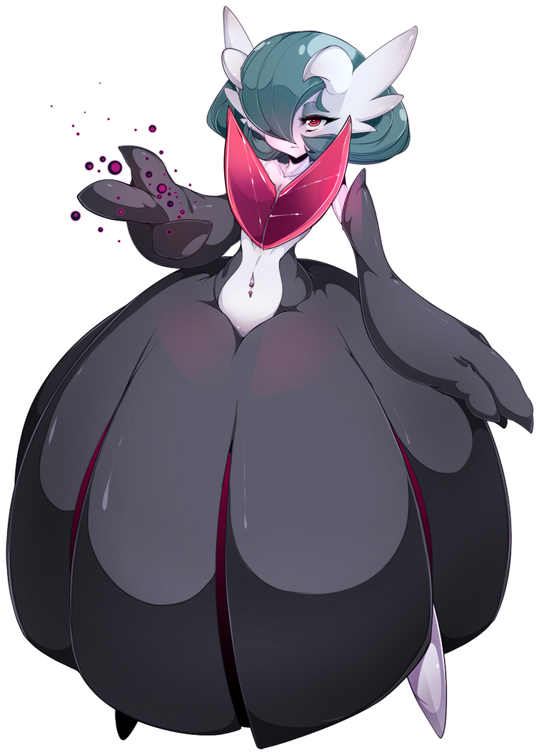
An artist who does great monster/antro characters is slugbox most of his work isn't suitable. But I really admire how he does chunky characters and I think that Kind of form would be really interesting to experment with when needle felting.

I particularly like his Pokemon anthro's because of how much Pokemon has inspired my work over the years.

If you are brave enough to see more of slugbox's work (I would recommend making sure the mature content filter is on) you can find his work on deviantart.com.

I recently found an artist on Instagram going by the name of  Zoe Williams @x03
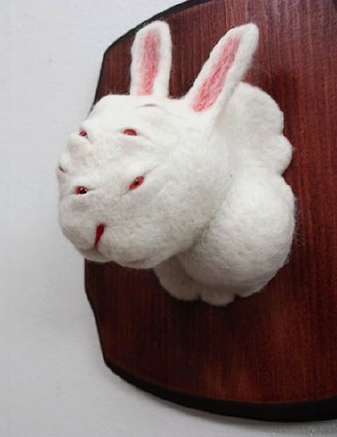
She makes needle felted sculptures, they are very minimalist and she makes such amazing eyes for them.
She make's taxidermy style busts they range from the more conventional to the more mutated like this rabbit with many eyes.

I would really like to explore this idea if the project permits it.


Book review: The art of Howl's Moving Castle

I am a huge fan of Studio Ghibli and my friends have helped me build up my collection of Studio Ghibli art books by buying me them for Christmases and Birthdays.

So The Book I will be talking about today is The Art Of Howl's Moving Castle. It is a collection of Sketches, illustrations, concepts, backgrounds and character design from the making of the film.  
Part one of the book shows Hayao Miyazaki's concept sketches, unlike western film directors Japanese film directors more specifically those dealing with animation are expected to draw concepts and the storyboards for the film before passing them onto other artists.


Hayao Miyazaki's concept sketches are normally pen and watercolour or pencil and water colour. Some are vague some are detailed.

"Howl's Moving Castle is set in a world conceived by late 19th century European neo-futurist painters where magic and science co-exist."


"On a research trip for Miyazaki's new film Howls moving castle. The staff visited Europe for 12 days and, although their research centered on the eastern province of Alsace in Francewhere the film was set, they also spent time in Heidelburg (Germany), and Paris, Visiting the Alsatian city Colmar for its colour and atmosphere proved to be a productive experience for the staff.  


A drawing of one of the scenes from the film.

In the film there is a parade going on which seems to be based around the military, People are waving flags and having a good time. 

The main protagonist Sophie is cursed by the witch of the wastes turning her into a 90 year old woman, she flees the hat shop where she was apprenticing under her step mother, and stumbles across howls moving castle.  


 Some storyboards drawn by Miyazaki as you can see they vary from detailed to rough sketch.

Part two of the book is all about character design finalizing concepts and what went into each part of the film.


Concept drawings of howl's castle.


Concepts for 18 year old Sophie (pre-curse)

Concept are for The Hatter's House at night (the hat shop).

This is how it looked in the film.

Grandma Sophie concepts, there was a lot of thought put into older Sophie's appearance.
"I was determined to make the aged Sophie look, cute, but I had to dismiss that approach almost imminently. She simply wouldn't look old without her skin being wrinkled and blemmished. She might appear plain, but I made sure she would have the appeal of a refined old lady."   

Michiyo Yasuda discusses the subtle changes in colour through out the film to convey emotions.  


Howl's room concept 

Howl's room in the film

 Howl's room (cave) concept 
 Howl's room (cave) in the film

Part three is a write up of the screenplay/script. It shows all of the characters lines and how they are supposed to be spoken any calls to action the voice actors might need to convey the lines correctly. It's really quite fascinating to look at.

Sunday, 3 May 2015

The future

Recently I have been feeling the pressure to really find a definite route I want to take my art and I have decided after degree to purse a career in a tattooing, I considered this before I started this degree I was even offered an apprenticeship and I let the opportunity pass me by because I wasn't confident enough in my artwork.

Now I have had time to think about it I have something unique to offer when it comes to style and I want to try and practice specifically doing work which will computationally lend itself to tattoo's. As far as tattoo styles I like I am a fan of "new school tattoos".


Image from checkoutmyink


Image from flickr
Tattoo by Autumn Tierney

Image from geeksaresexy
by Mina at Hawk and Sparrows in Malmö, Sweden.

Image from poundedink.com
by Kelly Dotty

I like new school tattoo's due the the vibrancy of the colours and how bold an beautiful they are. And I feel it really fits with the style I have established.

It maybe seen as a trend in tattooing but I am also really fond of the look of watercolour style tattoo's.

Image from huffingtonpost

Image from 1337tattoos.com
By Gene Coffey

Image from www.cuded.com

I love the fluidity of the linework (if applicable) in watercolour tattoo's, and again I love the vibrancy of the colours they use. The line's in watercolour tattoo's are varied some lines are think and bold, others look like brush and ink and some are swift and wispy.


Artist showcase Kidura

Kidura is a artist from the UK, whom I bought art from at Japan Day in 2014. She is strongly influenced by anime and manga and mostly draws fan art. I recently won a art giveaway she hosted and she is in the process of drawing me this piece.


The character is called Howl and he is from Howl's Moving Castle which is a book by Diana Wynne Jones which was later made into a movie by Studio Ghibli. I love both the book and the film even though the film follows a different path than the book.

I love how Kidura use's watercolour and her work most diffidently inspired me when I was doing my personal project. Her style is typical of someone inspired by anime and manga but it is the detail that she puts into her work that inspires me the most.

This was the piece I purchased from her in 2014.

This is a piece of Pokemon fan art, Pokemon is something which has always inspired me since I was a child and this scene is from a Pokemon game which was very influential in terms of me finding my threads of interest which lead to my art style today.

See more of Kidura's work here .facebook.com/kidura

Saturday, 2 May 2015

Book cover research for Alice's Adventures in Wonderland and Personal Project

Since I would have to do book cover research for two projects I thought I would post it all in one chunk rather than two separate posts.

I am not sure who the artist of this cover is but this is the Japanese cover created in 2009, I was drawn to the cover because of the flat colour style which is something I have tried in my work before.

Hugh D’Andrade’s pink, leather-bound Alice's Adventures in Wonderland is very eye catching I love the black and pink together I think it really stands out. The limited amount of gold is also aesthetically pleasing. The cover is very bold and something I would definitely pick up out of interest.

Images from flavorwire.com


This cover by Sophie Douglas really helped inspire the more handcrafted feel I went with in my Alice's Adventures in Wonderland. I really love the lino cut look of this cover it wasn't the look I wanted to go with but it was the rough and readiness about it that I was drawn to.


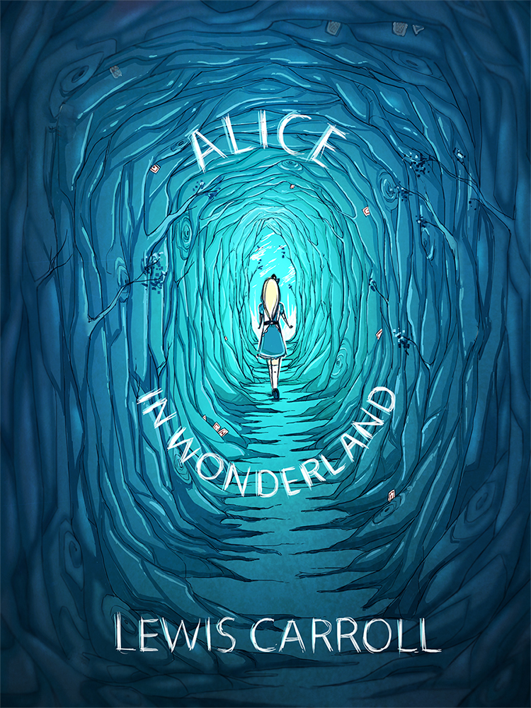
This is not an offical cover but this design by pannucabaguana on deviantart, I really liked the blues they used in this cover concept  and I also thought the font fit nicely with the aesthetic.

Image from deviantart.com


I found the cover for this book very creative I just had to mention it because it is simple but absolutely genius. 

Image from flavorwire.com 


These are some beautiful book covers for Ian Fleming's James Bond, I absolutely love these covers, the colours the women's expressions and how they fit together as a series.

Image's from littlegoldpixel.com


I also looked at some comics, indie comics and zine covers to get an idea for my personal project.

This cover from the indie comic Godkiller has a wonderful colour scheme it is limited but very eye catching the comic is post-apocalyptic and I definitely get that vibe from the cover alone.
Image from www.wired.com


Nurse Nurse by Kate Skelly has a very simplistic style that isn't seen much in indie comic's, the simplicity of this cover is what drew me to it. The cover has an even more limited colour pallet than Godkiller looking at how effective the two covers where made me want to experiment with limited colour.

Image from bitchmagazine


John showed me a Japanese manga called Uzamaki which was disturbing but had an interesting aesthetic.  


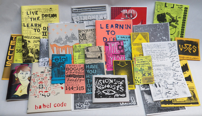
I went to the Salford Zine library earlier in the year, The visit really helped inspire me for both my Alice's Adventures in Wonderland and my personal project. The organicness of the drawings and type is what I really liked most.