Translate

Showing posts with label zines. Show all posts

Sunday, 20 March 2016

Thoughts For Final Show

Recently I have been thinking a lot about the final show and what I want to display and I feel my uni work is just not making the cut for me personally. So I have started to produce work outside of uni that I would rather display. 

I want to display work that I genuinely enjoy making because I feel that it really shows in the finished pieces. I am setting RaelDanger up as a brand rather than just me being an illustrator and the degree show will be a good place to showcase my brand. After Fig Taylor came in I felt like I was left with very few options with where my work could take me, but after thinking about it for the past few months I have decided I want to put my artwork onto apparel. I feel like the graphic and vibrant nature of my work really lends itself to t-shirts, dresses etc.

Brands I feel that are good examples for what I would like to do is 

Iron Fist


Carries a lot of bold and vibrant designs aimed at teens and young adults.

Emily Strange
Emily Strange is a particularly good example since not only is Emily Strange a clothing brand, but they have produced comics, books, figures, plush toys, prints etc. And the brand is centred around a character called Emily Strange and her four black cats. Much like my work

"She first appeared on a sticker distributed at concerts, record stores and skate shops to promote Cosmic Debris, the clothing line founded by artist and skateboarder Rob Reger, racecar driver Matt Reed and Nathan Carrico, who designed Emily in 1991 for Santa Cruz Skateboards in Santa Cruz, California."

I can see how my brand could work in a similar way since my artwork is very character centric . 


Monday, 12 October 2015

Hand Lettering

Something I want to improve on this year is my hand lettering, tutors and other people have told me I have a natural nack for it. I am not into the technical ins and outs of typography but I do like my work when it includes hand lettering. In my recreational sketchbooks I like to sort of journal element, the work I do for myself is very much about what is going on in my life and how I am feeling. Some pages feature dairy style entries some just a phrase that sums up my day or how I am feeling in the moment. Sometimes it's just balls to the walls craziness that just rolls off the top of my head.


I want my work to have a more ziney feel, I like the spontaneous nature of it. I can collect, experiment more like that. One thing I don't like to see in my work is blank space, I like my work to be lively and I feel hand lettering really helps me fill in those blank spaces.

Some YouTube tutorials

How To DIY Modern Calligraphy
Hand Lettering Step By Step
Modern Calligraphy: Marcelle Lettering
Brush Script Lettering Basics This one is really helpful


Monday, 5 October 2015

Uni project and upcoming stall

My university project 'Outside The Penthouse' is about dispelling preconceptions of the homeless.
Going straight into doing work about homeless people didn't work out very well, I found myself really hitting brick walls, thinking that my super vivid style just wouldn't fit the message I was trying to convey.

I had the idea of depicting the homeless people as monsters because a lot of people seem to adopt the attitude that they shouldn't exist and to validate this I feel people connect negative connotations to homeless people. The most common being drunks, druggies, lazy and uneducated.
I wanted to pull the carpet out from peoples feet and show them how they have been thinking about homeless people compared to how they should be viewing them.

A big challenge with this project it to keep it out of the realm of being too condescending but also try and make it so it isn't a guilt trip. Talking to members of my class they told me that most charity ads are patronizing or tell the viewer though the use of black and white that this should make them feel sad. People don't like being told what they should feel on a subject, that's the reason why differing opinions can spark arguments. I have thought at length how I can stay clear of all of these things and realized it's probably not possible to do, my priority instead has to be keeping these factors to a minimum.

People told me they would rather see something that is uplifting and that will inspire people to help rather than something gloomy which would just depress the intended audience.

My tutor recommended I step away from the theme of homelessness for a bit and focus on creating characters (which is what I enjoy doing) and that has really unblocked me creatively. Since switching the focus I have been coming up with concepts I really enjoy. The project before had become a chore but now it has become something I do for enjoyment and if I have learned anything forcing creativity rarely gives good results. Also my tutor's lecture on metaphor really helped me come up with new ways of communicating my chosen message without blocking myself off creatively.


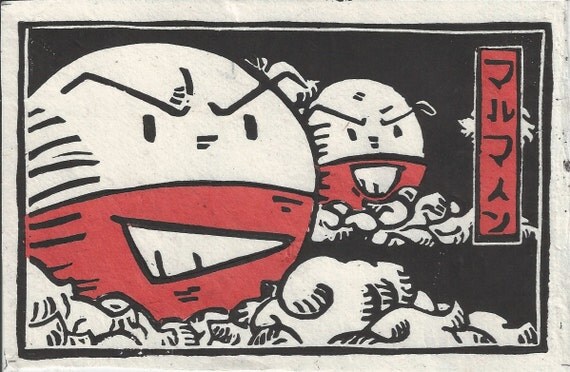
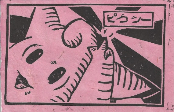
Switching topic, I have a stall coming up in November and I am focusing on making things that are reproducible in order to keep the balance between my stall and uni work. So far I have come up with the idea of doing lino prints, I had a little look on etsy to see if anyone does pop culture inspired lino prints and found one person by the name of Chase or TheBeardedGoldfish as the shop name is called.
If there is one thing in this world I love, it is Pokemon. And Chase does very unique Pokemon lino prints (if only he shipped to the UK). I have always loved the bold look of lino prints. 

He prints them on to rice paper of different colours depending on the character in the print.
I think the boldness of a lino print would look absolutely amazing paired with a vivid watercolour background that I have recently been creating with Dr Ph Martins concentrated watercolours.

This is also something I would love to experiment with for 'Outside The Penthouse'. Maybe I could even bind them into a zine format.


Wednesday, 6 May 2015

Personal project reflection

My personal project went through many changes throughout the project. It started as a zine turned into a comic turned back into a zine. It was suggested to me that I hand bound using coptic or stab stitch binding but instead I opted for heat binding it. If we are realistic if I was to sell these zines the hand binding wouldn't be cost effective or time effective driving the prices up. Also with how thick the zine ended up being it would be a risk to bind it that way because it could crinkle the paper that would effect the overall look of the zine. I also decided to no print the images back to back because I didn't want the pages bleeding into each other also I feel like I am unveiling each new piece as I turn the pages.

Saturday, 2 May 2015

Book cover research for Alice's Adventures in Wonderland and Personal Project

Since I would have to do book cover research for two projects I thought I would post it all in one chunk rather than two separate posts.

I am not sure who the artist of this cover is but this is the Japanese cover created in 2009, I was drawn to the cover because of the flat colour style which is something I have tried in my work before.

Hugh D’Andrade’s pink, leather-bound Alice's Adventures in Wonderland is very eye catching I love the black and pink together I think it really stands out. The limited amount of gold is also aesthetically pleasing. The cover is very bold and something I would definitely pick up out of interest.

Images from flavorwire.com


This cover by Sophie Douglas really helped inspire the more handcrafted feel I went with in my Alice's Adventures in Wonderland. I really love the lino cut look of this cover it wasn't the look I wanted to go with but it was the rough and readiness about it that I was drawn to.


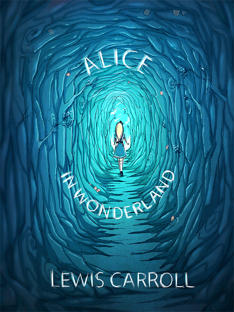
This is not an offical cover but this design by pannucabaguana on deviantart, I really liked the blues they used in this cover concept  and I also thought the font fit nicely with the aesthetic.

Image from deviantart.com


I found the cover for this book very creative I just had to mention it because it is simple but absolutely genius. 

Image from flavorwire.com 


These are some beautiful book covers for Ian Fleming's James Bond, I absolutely love these covers, the colours the women's expressions and how they fit together as a series.

Image's from littlegoldpixel.com


I also looked at some comics, indie comics and zine covers to get an idea for my personal project.

This cover from the indie comic Godkiller has a wonderful colour scheme it is limited but very eye catching the comic is post-apocalyptic and I definitely get that vibe from the cover alone.
Image from www.wired.com


Nurse Nurse by Kate Skelly has a very simplistic style that isn't seen much in indie comic's, the simplicity of this cover is what drew me to it. The cover has an even more limited colour pallet than Godkiller looking at how effective the two covers where made me want to experiment with limited colour.

Image from bitchmagazine


John showed me a Japanese manga called Uzamaki which was disturbing but had an interesting aesthetic.  


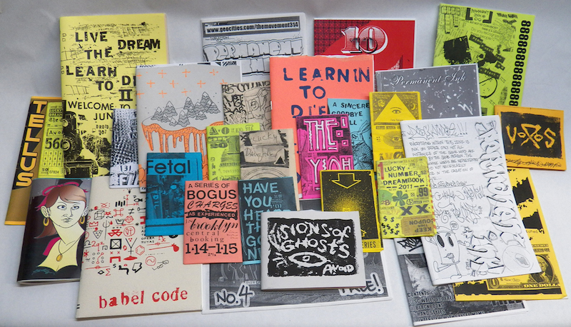
I went to the Salford Zine library earlier in the year, The visit really helped inspire me for both my Alice's Adventures in Wonderland and my personal project. The organicness of the drawings and type is what I really liked most.


Thursday, 30 April 2015

1,2,3

This post is about three of the best pieces of advice I have been given since starting the course some of these will not be a piece of advice per say more of a turn in the right direction.

1. The zine making workshop

In the zine workshop I learned that working on pages which already had some preexisting texture or image on really help one overcome blank page anxiety or new sketchbook anxiety. I am someone who can get very hung up on their work and want every page to be perfect while in the zine the perfection is that it isn't perfect it has misspells, it has sketches done on lined paper, receipts, napkins, photocopies from things that inspired you through out. for me I think it is the perfect way to document and brainstorm (and kick a sketchbook buying addiction). There is something wonderful about making it yourself, selecting the papers and the binding. It's like having a little nugget of personality. Personally next year I want to do away with having sketchbooks and just bind my own zine style sketchbooks I think it really helped me with my process when it came to Alice's Adventures in Wonderland.

2. Be a flaneur

There are so many things you miss when you have your mind set on a destination, enjoy just taking everything in and being purposefully lost. I made another post called Ode to Manchester which really explains in depth what happened when I was being a flaneur in Manchester during my Tales of The City project. I class Manchester as my hometown over Salford and I was surprised by how much of Manchester I have never seen before despite spending a lot of time there over the years. What really grabbed me was how much of Manchester juxtaposes, I saw posh bars next to dingy alleyways and crumbling walls of old factories. Austerity and prosperity dwelling right next door to one another, I felt like if the bars could speak they would be gloating.

3. Don't be afraid to take on more than you can chew (sometimes)

I have a habit of doing very ambitious projects, I feel like a cat with nine lives just managing to pull through every time. The good thing about having ambitious projects is it keeps you engaged because you have to stay engaged or the project will crumble, it forces you to make use of all the time you have. It's stressful but seeing the final outcomes is a great feeling.

Tuesday, 3 March 2015

Personal Project: Choose your own ending

Before this project began I was in a comic book shop in Manchester called Travelling Man and my friends found a Batman choose your own adventure book. I have come across this concept before but it had never really inspired me, I also came across a comic by an artist I follow called Sophira-Lou and ended up buy it. I started to look at the indie comics in the store and came to the conclusion I could do it if I put my mind to it. The two ideas merged later that day and I decided I would propose it for my Personal Project.

My idea is to write 2-3 open ended stories and have other people decide what the ending should be. I would have my own ending I would keep a secret until the end. At first I wanted to send out physical zones but now I have thought about it I may do it via digital download.

I am buying two books I am hoping will help me with this project

How to Be an Explorer of the World: Portable Life Museum
Picture from www.farwakazmi.com
and 

The Imaginary World Of

Picture from www.groovinmoms.com

by Keri Smith

I'm also considering buying

Mess: The Manual of Accidents and Mistakes also by Keri Smith

I think these books will really help me with this project by loosening my creative muscles and help me think more open-mindedly about my project.

The purpose of my project is to help people understand how creativity can enrich your life via

  • Community projects and collaboration 
  • Creative achievement 

Choose your own adventure stories are commonly written in second-person so the reader can assume the role of the protagonist. But my story will follow a half monster called Grenade and how she deals with getting used to the human world.

Grenade in this story is based off a ball jointed doll I own, who's character I modelled after a character I created for a project back in foundation. (for more on bjd's take a look at my last post)

The series was based on a concept created by Edward Packard and originally published by Constance Cappel's and R. A. Montgomery's Vermont Crossroads Press as the "Adventures of You" series, starting with Packard's Sugarcane Island in 1976.

Picture from www.goodreads.com

Friday, 24 October 2014

Anti Bullying Zine

For my second project of level 5 I chose to do a project on cyber bullying, I have very strong links with this subject matter and have always wanted to do something to raise awareness.

I decided to do an 8 page folded zine, these are easy and cheap to make and distribute if needed.

I have so far done 2 pages of the zine.


The front page, I wanted to use different typefaces to create a cut up dada style. I also wanted to make it quite high contrast so it would stand out and people would be drawn to it but I also wanted to stick with gray scale for the cover just to keep with the typical zine look.

With the first page I wanted to get straight into how to deal with being cyber bullied. I narrowed it down to three simple steps Ignore, Record and Report for bullying offline I would give different advice. I found I was bullied less when I stood up for myself instead of staying quiet. But online standing up for yourself only adds fuel to the fire.

When I'm done I would like to make my zine free and available for people to print out and distribute as long as they keep the end page (which will tell people it was written by me and where contact me).

I want the zine to include why people bully and positive traits which are common among people who are bullied. But I also want people to reach out to the bullies, because bullies bully for a reason and more time needs to be spent on listening so less will be spent on bullying.


This is one of the video's I watched when I was first thinking of making a zine.

I would like to do more zines like this focusing on bullying and mental health.