Miss Wah is a manga inspired street artists which I have been a loyal follower of for years and I've seen her grow from being a small artist on youtube to a successful street artist. She has a website where she sells her prints and stickers. It's been very inspiring to see a female street artist gain such an audience.
The email is quite casual since I have actually spoken to her before and she has previously given me advice on how to get into street art legally. So I thought I would contact her again since she was very helpful last time.
Hi,
as part of my course I have been asked to contact artists in a position I aspire to be in to give me a bit of feedback on my portfolio. I have a small PDF portfolio I can show you that isn't very long and won't take much time to look at. I would really appreciate it if you would take a look. I think your work is amazing I have been a follower of yours for years (from before you started doing street art) seeing you grow as an artist has been really inspiring to me, so your feedback would be really appreciated.
Thanks in advance
Sophie
20/04/2016
Miss Wah got back to me unfortunately she is quite busy at the moment so her feedback would be after the blog deadline. I will still send my pdf portfolio to her anyways because I am very interested in what she would think of my work.
Showing posts with label Comic. Show all posts
Showing posts with label Comic. Show all posts
Monday, 18 April 2016

Sunday, 20 March 2016
Thoughts For Final Show
Recently I have been thinking a lot about the final show and what I want to display and I feel my uni work is just not making the cut for me personally. So I have started to produce work outside of uni that I would rather display.
I want to display work that I genuinely enjoy making because I feel that it really shows in the finished pieces. I am setting RaelDanger up as a brand rather than just me being an illustrator and the degree show will be a good place to showcase my brand. After Fig Taylor came in I felt like I was left with very few options with where my work could take me, but after thinking about it for the past few months I have decided I want to put my artwork onto apparel. I feel like the graphic and vibrant nature of my work really lends itself to t-shirts, dresses etc.
Brands I feel that are good examples for what I would like to do is
Iron Fist


I want to display work that I genuinely enjoy making because I feel that it really shows in the finished pieces. I am setting RaelDanger up as a brand rather than just me being an illustrator and the degree show will be a good place to showcase my brand. After Fig Taylor came in I felt like I was left with very few options with where my work could take me, but after thinking about it for the past few months I have decided I want to put my artwork onto apparel. I feel like the graphic and vibrant nature of my work really lends itself to t-shirts, dresses etc.
Brands I feel that are good examples for what I would like to do is
Iron Fist

Carries a lot of bold and vibrant designs aimed at teens and young adults.
Emily Strange
Emily Strange is a particularly good example since not only is Emily Strange a clothing brand, but they have produced comics, books, figures, plush toys, prints etc. And the brand is centred around a character called Emily Strange and her four black cats. Much like my work
"She first appeared on a sticker distributed at concerts, record stores and skate shops to promote Cosmic Debris, the clothing line founded by artist and skateboarder Rob Reger, racecar driver Matt Reed and Nathan Carrico, who designed Emily in 1991 for Santa Cruz Skateboards in Santa Cruz, California."
I can see how my brand could work in a similar way since my artwork is very character centric .
Wednesday, 13 January 2016
Future self initial ideas
So future self is a little bit of a tricky unit for me, I don't have one set career goal, I want to give most things a try. So I don't see myself sticking to one path permanently for now at least. I know for certain I'm not really interested in editorial and I would rather illustrate my own creations rather than the creations of others.
So I am more drawn to authorstrator focused projects, I think that is why I didn't do so well in my last project. I focused to much in creating from existing material rather than responding to my own material. But after talking to Ian about where I went wrong and points he felt I should focus on I have a better idea of what I can do for this project and how to best make use of my skills.
Pathways which do interest me are
Tattooing
Fabric design
Book Illustration
Band Poster Illustration
Game concept design/Character design
Toy design
So for this project I want to combine a few of these and focus on making products which would be sellable.I wanted to make fabric designs incorporating, tattoo and character design aspects. I would then have a seamstress make the fabric into dresses. I have also thought about making a book (possibly pop up) incorporating tattoo style artwork combined with character design, I would like to aim this book at 13-25 year olds.
I am concerned I have too many ideas since that was another downfall in my last project.
So I am more drawn to authorstrator focused projects, I think that is why I didn't do so well in my last project. I focused to much in creating from existing material rather than responding to my own material. But after talking to Ian about where I went wrong and points he felt I should focus on I have a better idea of what I can do for this project and how to best make use of my skills.
Pathways which do interest me are
Tattooing
Fabric design
Book Illustration
Band Poster Illustration
Game concept design/Character design
Toy design
So for this project I want to combine a few of these and focus on making products which would be sellable.I wanted to make fabric designs incorporating, tattoo and character design aspects. I would then have a seamstress make the fabric into dresses. I have also thought about making a book (possibly pop up) incorporating tattoo style artwork combined with character design, I would like to aim this book at 13-25 year olds.
I am concerned I have too many ideas since that was another downfall in my last project.
Monday, 5 October 2015
Uni project and upcoming stall
My university project 'Outside The Penthouse' is about dispelling preconceptions of the homeless.
Going straight into doing work about homeless people didn't work out very well, I found myself really hitting brick walls, thinking that my super vivid style just wouldn't fit the message I was trying to convey.
I had the idea of depicting the homeless people as monsters because a lot of people seem to adopt the attitude that they shouldn't exist and to validate this I feel people connect negative connotations to homeless people. The most common being drunks, druggies, lazy and uneducated.
I wanted to pull the carpet out from peoples feet and show them how they have been thinking about homeless people compared to how they should be viewing them.
A big challenge with this project it to keep it out of the realm of being too condescending but also try and make it so it isn't a guilt trip. Talking to members of my class they told me that most charity ads are patronizing or tell the viewer though the use of black and white that this should make them feel sad. People don't like being told what they should feel on a subject, that's the reason why differing opinions can spark arguments. I have thought at length how I can stay clear of all of these things and realized it's probably not possible to do, my priority instead has to be keeping these factors to a minimum.
People told me they would rather see something that is uplifting and that will inspire people to help rather than something gloomy which would just depress the intended audience.
My tutor recommended I step away from the theme of homelessness for a bit and focus on creating characters (which is what I enjoy doing) and that has really unblocked me creatively. Since switching the focus I have been coming up with concepts I really enjoy. The project before had become a chore but now it has become something I do for enjoyment and if I have learned anything forcing creativity rarely gives good results. Also my tutor's lecture on metaphor really helped me come up with new ways of communicating my chosen message without blocking myself off creatively.
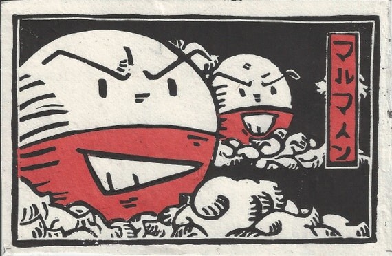
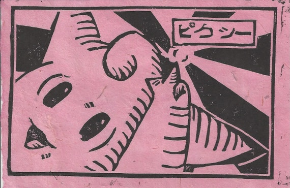
Switching topic, I have a stall coming up in November and I am focusing on making things that are reproducible in order to keep the balance between my stall and uni work. So far I have come up with the idea of doing lino prints, I had a little look on etsy to see if anyone does pop culture inspired lino prints and found one person by the name of Chase or TheBeardedGoldfish as the shop name is called.
Going straight into doing work about homeless people didn't work out very well, I found myself really hitting brick walls, thinking that my super vivid style just wouldn't fit the message I was trying to convey.
I had the idea of depicting the homeless people as monsters because a lot of people seem to adopt the attitude that they shouldn't exist and to validate this I feel people connect negative connotations to homeless people. The most common being drunks, druggies, lazy and uneducated.
I wanted to pull the carpet out from peoples feet and show them how they have been thinking about homeless people compared to how they should be viewing them.
A big challenge with this project it to keep it out of the realm of being too condescending but also try and make it so it isn't a guilt trip. Talking to members of my class they told me that most charity ads are patronizing or tell the viewer though the use of black and white that this should make them feel sad. People don't like being told what they should feel on a subject, that's the reason why differing opinions can spark arguments. I have thought at length how I can stay clear of all of these things and realized it's probably not possible to do, my priority instead has to be keeping these factors to a minimum.
People told me they would rather see something that is uplifting and that will inspire people to help rather than something gloomy which would just depress the intended audience.
My tutor recommended I step away from the theme of homelessness for a bit and focus on creating characters (which is what I enjoy doing) and that has really unblocked me creatively. Since switching the focus I have been coming up with concepts I really enjoy. The project before had become a chore but now it has become something I do for enjoyment and if I have learned anything forcing creativity rarely gives good results. Also my tutor's lecture on metaphor really helped me come up with new ways of communicating my chosen message without blocking myself off creatively.
Switching topic, I have a stall coming up in November and I am focusing on making things that are reproducible in order to keep the balance between my stall and uni work. So far I have come up with the idea of doing lino prints, I had a little look on etsy to see if anyone does pop culture inspired lino prints and found one person by the name of Chase or TheBeardedGoldfish as the shop name is called.
If there is one thing in this world I love, it is Pokemon. And Chase does very unique Pokemon lino prints (if only he shipped to the UK). I have always loved the bold look of lino prints.
He prints them on to rice paper of different colours depending on the character in the print.
I think the boldness of a lino print would look absolutely amazing paired with a vivid watercolour background that I have recently been creating with Dr Ph Martins concentrated watercolours.
This is also something I would love to experiment with for 'Outside The Penthouse'. Maybe I could even bind them into a zine format.
Wednesday, 6 May 2015
Personal project reflection
My personal project went through many changes throughout the project. It started as a zine turned into a comic turned back into a zine. It was suggested to me that I hand bound using coptic or stab stitch binding but instead I opted for heat binding it. If we are realistic if I was to sell these zines the hand binding wouldn't be cost effective or time effective driving the prices up. Also with how thick the zine ended up being it would be a risk to bind it that way because it could crinkle the paper that would effect the overall look of the zine. I also decided to no print the images back to back because I didn't want the pages bleeding into each other also I feel like I am unveiling each new piece as I turn the pages.
Saturday, 2 May 2015
Book cover research for Alice's Adventures in Wonderland and Personal Project
Since I would have to do book cover research for two projects I thought I would post it all in one chunk rather than two separate posts.


I am not sure who the artist of this cover is but this is the Japanese cover created in 2009, I was drawn to the cover because of the flat colour style which is something I have tried in my work before.

Hugh D’Andrade’s pink, leather-bound Alice's Adventures in Wonderland is very eye catching I love the black and pink together I think it really stands out. The limited amount of gold is also aesthetically pleasing. The cover is very bold and something I would definitely pick up out of interest.
Images from flavorwire.com

This cover by Sophie Douglas really helped inspire the more handcrafted feel I went with in my Alice's Adventures in Wonderland. I really love the lino cut look of this cover it wasn't the look I wanted to go with but it was the rough and readiness about it that I was drawn to.
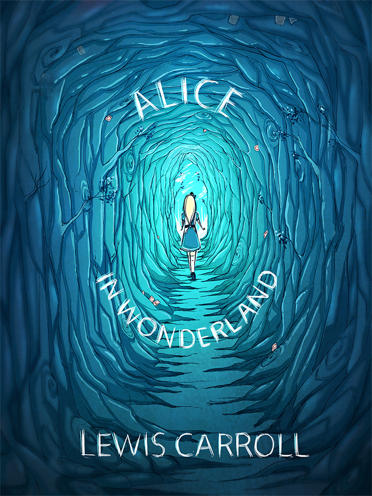
This is not an offical cover but this design by pannucabaguana on deviantart, I really liked the blues they used in this cover concept and I also thought the font fit nicely with the aesthetic.
Image from deviantart.com

I found the cover for this book very creative I just had to mention it because it is simple but absolutely genius.
Image from flavorwire.com

These are some beautiful book covers for Ian Fleming's James Bond, I absolutely love these covers, the colours the women's expressions and how they fit together as a series.
Image's from littlegoldpixel.com
I also looked at some comics, indie comics and zine covers to get an idea for my personal project.

This cover from the indie comic Godkiller has a wonderful colour scheme it is limited but very eye catching the comic is post-apocalyptic and I definitely get that vibe from the cover alone.
Image from www.wired.com
Nurse Nurse by Kate Skelly has a very simplistic style that isn't seen much in indie comic's, the simplicity of this cover is what drew me to it. The cover has an even more limited colour pallet than Godkiller looking at how effective the two covers where made me want to experiment with limited colour.
Image from bitchmagazine


John showed me a Japanese manga called Uzamaki which was disturbing but had an interesting aesthetic.
Images from popculturesocial.club and bloody-disgusting.com
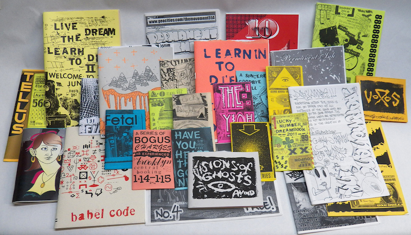
I went to the Salford Zine library earlier in the year, The visit really helped inspire me for both my Alice's Adventures in Wonderland and my personal project. The organicness of the drawings and type is what I really liked most.
Image from viralart.vandalog.com
Subscribe to:
Posts (Atom)